Pages

Monday, August 11, 2025

Shoppers - Dumfries, VA: Peaks and Valleys (Part 1)

UPDATE January 25, 2026: New cover photo and cart corral section added.

Welcome back to the Shoppes of Battery Mill, where values come to life! (do I have the right warehouse chain?) In this installment, I'm catching up with an old grocery retailing friend to see how things have been going for them this decade.

 Photos taken on July 18, 2023 by BatteryMill

Store information

  • Store number*: #2381 (current), #74/#2674/#052074 (former)
  • Address: 4174 Fortuna Center Plaza, Dumfries, Virginia 22025
  • Opening date: June 5, 2005
  • Decor package: Fresh & Healthy 3.0
  • Features: Deli, Meat & Seafood Counter, Bakery, Beer & Wine, Shoppers Café

Long one of the Washington, D.C.-area's "big 3" supermarkets (alongside Giant and Safeway), Shoppers has logically been a staple of my retail blogs. I've showcased numerous Shoppers locations and dug deep into their illustrious past, all while enjoying dozens of Colossal Donuts along the way. Yet, in my 10+ years of retail photos and history documentation, there seems to be less to get out of Shoppers as the calendars change.

With the continuing evolution of the D.C. grocery landscape beyond the three traditional titans, and troubles at corporate parent SuperValu (later absorbed into United Natural Foods, or UNFI), this past decade has been understandably rough for Shoppers. The chain's detour through the badlands has routed them amidst corporate consolidation passes, onto administrative layoff exits, around a dotted map of store closings, as well as into an infinite desert of no pharmacies. Shoppers' UNFI-supplied wheels were starting to fall off only four years down the line as the wholesaler hinted at passing on the title or cutting support off entirely. Sister chains such as Save A Lot, Farm Fresh, and Hornbacher's had gone down this path before, each to varying results.

Source: wamu.org
In the same vein, it looked as if it was the end of the road for what was once a warehouse grocery pioneer. A late 2019 wave of store closings and sales to new competitors like Lidl lit a low fuel sign on Shoppers' dashboard. Crossing into the year of 2020, additional closings were tacked on as the tank was projected to go empty that summer. But did it really?

As we know, a global pandemic shook the nation. People rushed in droves to get the essentials everyday at Shoppers, as well as at remaining UNFI banners like Cub. Executives believed it wouldn't be a wise decision to proceed with the initial sunsetting plan for these chains. Therefore, Shoppers and said UNFI holdings were refueled with an initial 18-month stimulus package, followed by a new, indefinite membership. This Washington metro supermarket standby was thought saved. In a few ways, at least.

For a time in 2022 to 2023, UNFI recommitted to Shoppers Food & Pharmacy. Several stores sold to independent operators during their 2019 closing round returned to the Shoppers fray. A new decor package was launched, and an ambitious expansion plan returned the food retailer to the Southern Maryland region in a big way. Not everything is keeping the cogs of Shoppers Food Warehouse turning, however. The rest of the store base, as one will see, leaves questions to be answered. Then there are the closings. They keep on coming. Sure, those locations might have their reasons, but it stacks up more riddles than a comic book villain.

Even in the most uncertain of times, one can certainly generate answers to some questions. Where does Shoppers stand in the 2020s? How and when did it begin its walk on the boulevard of broken dreams? The way I'm going to answer this question today is to sample one of their salesfloor offerings from their mid-2000s peak. Not only am I going to take a look back at when SFW loomed large over Washington and Baltimore alike, but also reflect on what kind of shadow that golden age casts on its stores today.

Store history

Shoppers has maintained a presence in the Fortuna Center Plaza shopping center for two decades. That busy strip mall, located off VA 234 (Dumfries Road) near the mighty Interstate 95, has many reasons to draw customers to each of it store, and it has lived up to the name well. Featuring renowned retailers like Target and restaurants like Five Guys, Panera Bread, and the omnipresent Starbucks, it is only logical that the center have a solid supermarket centerpiece. Said centerpiece just so happens to be Shoppers. Many people might say they don't fit in with the newer homes and trendier tenants of the center. So how did they get here, seeing as times have changed? Let's answer this question.


Located in the southern corner of Northern Virginia's Prince William County, Dumfries was once a sleepy town located near the banks of the Potomac River. While rich in historic interest (like its northwestern neighbor), it never held significant growth. That was, until the establishment of local transportation networks occurred. The rise of surrounding suburbs like Woodbridge and Dale City thus changed Dumfries' fortunes. Local developments such as Montclair and Southbridge would terraform this portion of the county into the new millennium. Therefore, a concordant need for more retail space came about, just as all those houses were being built. One would believe Woodbridge to the northeast already had a brisk retailing market ready to serve the entirety of eastern PWC, including an expansive Shoppers adjacent to the famed Potomac Mills mall. With around 20,000 local residents as of the 2000 U.S. Census, though, Shoppers was itching to break ground on a store down Dumfries way.
 
Shoppers' presence in Dumfries is also tied to the troubles of their biggest rival. Giant Food was allegedly tapped as a tenant for a proposed new shopping center located along Route 234 in 2004. Just as the center was moving forward, however, things got shaky for the Big G. Their 1998 acquisiton by Dutch conglomerate Royal Ahold started in solid shape, though would eventually bear marks of stress under pressure. Giant's parent company's finances lagged in this time, and a 2004 fraud scandal would be the breaking point. It was also at this time that Ahold consolidated operations with sister chain Stop & Shop, marking the departure of many longtime executives and thus lessening focus on expansion. Giant thus took some years off to adjust to the standards of their New England colleagues, all while their corporate parents balanced finances. Shoppers, meanwhile, saw another golden opportunity.
 
One of the SuperFreshes acquired from A&P, located in Forestville, MD. Source: shoppersfood.com

 While Giant entered the sophomore slump of their Ahold stint, Shoppers was an honor roll student under SuperValu's tutelage. The 1980s and 1990s were the chain's golden age. Shoppers was a supernova bursting out of the laggard Jumbo Food chain, swelling to nearly 40 locations by 2000, all thanks to its commendable warehouse format and innovations. Even through its own corporate adventures, like the Haft/Dart Group mess and entering the SuperValu fold in 1999, the momentum did not stop heading into the new millennium. Some may say Shoppers' downfall was incited by their pivot away from warehouse grocery and subsequent upscaling, as we see at Dumfries. Yet, SFW consistently refreshed and rebuilt stores, found success with pharmacies and in-store banks, and also made major expansion moves. The latter included acquiring four ex-SuperFreshes, taking over sister chain Metro and venturing into the Baltimore market, and taking advantage of rising suburbs (Gainesville, Laurel, and here).
Source: Potomac News (newspapers.com)

After signing on in a flash, construction began on the store, as with the rest of Fortuna Center Plaza. Finally, on June 5, 2005, officials from Shoppers and Prince William cut the ribbon on the 66,870-square foot store, complete with all the chain's bells and whistles found in their expansive stores of the day. 
For the next several years, the store benefitted greatly from continued suburban growth, adjacent businesses, and their brand being the strongest it had ever been. Target, along with several other establishments quickly followed to the scene. A standalone Rite Aid was constructed out front approximately two years later, enticing external pharmacy customers to get their groceries at Shoppers. 
 
Heading into the 2010s, when issues began showing at Shoppers and SuperValu, the store continued a steady pattern of business. Yet, the Minnesota-based wholesaler behind Shoppers continued some investment into the chain, as was evident at this store. 
Source: Shoppers (facebook.com)

That was because the Dumfries location embarked on its first remodel in the fall of 2015, ten years into its life. The package, modeled off other SuperValu chains' Fresh & Healthy 3.0 package, made its way around other Shoppers between 2010 and 2016. Clearly, some effort was still being made to refresh the chain's image. No significant updates have happened since, but the store has held on through numerous Shoppers closing rounds, as we will see today. That being said, let's head on down to Dumfries and explore the chain and all their peaks and valleys!

Store tour

Checking out the left side to grab a cart, we take a look at the shopping center's color palette. We also see some standard Shoppers signage: instructions to pick up shopping carts, their cart policy, and the cart-based logo leaving their warehouse mark on customers. All buggy-related, yes, but what else do we have going on here? On a more interesting note, these are all adapted from Shoppers stores of the past (especially this one pre-remodel).

I find it fascinating that Shoppers holds on to these small hallmarks of their decor, all while updating them to modern standards. However, we will see the original versions as we go along.

Veering over to the right side of the store for a bit, we can see the window stickers for the Shoppers Cafe in-store seating areas. These started with the pre-SuperValu Shoppers Club concept and stuck through their post-SuperValu years.

This sticker is original to the store, evident by its aesthetic leanings, including the use of the Helvetica font found in their mid-2000s decor package. We will see a few more of these artifacts today, so keep your eyes peeled!

Entering through the right doors, the first major section of the store we are greeted with is the produce department, which is adjacent to deli and seafood. This area has all the usual hallmarks of Shoppers, then and now and is decently stocked. There are also several types of deli coolers to choose from, all with their own options for prepared food and a lowered ceiling to promote such. In recent years, Shoppers has made some updates, including a chain-wide lighting upgrade circa 2017 (though not all lights were replaced, as we will see) and replacing the high-energy produce display coolers with market-style tables. The more important thing here, however, is the quirk of this layout. If you are familiar with this chain, did you see these departments have switched sides? That's because this store piloted a new twist on the familiar Shoppers layout. 

Traditionally, produce would occupy the front corner of the salesfloor, whereas the deli and seafood kitchens stood as a "box" unit aligned towards center store. This setup cast the above departments away from everything else, signaling that service departments and perishable products were still important to such a price-conscious grocer. The rows of grab-and-go coolers and hot food bars switched sides, along with that peculiar lowered ceiling. Produce accordingly filled the kitchens' vacancy, with the bordering bakery and international aisles taking in the sunshine. Elsewhere, everything remained in its usual position. Save for customer service, that is. Party to a butterfly effect, the desk was slotted in front of the registers (and the facade), since there was no deli box to wrap it around like before.

Why exactly was this change made? As with many retail questions I have, I can't say for sure. I do have some theories about that.

With Shoppers' departure from their deep-discount roots, their architectural standards likely became more liberal. It is equally likely that retail design trends may have evolved by 2005. Nevertheless, the concept was replicated at other Shoppers builds that followed Dumfries. I believe that this is a testament to Shoppers keeping up with the times in a graceful way, especially at the peak of their market power. Heck, I'd argue it's less polarizing than another open floor plan trend.

Bathroom break! These restrooms are accessible through the Shoppers Cafe, and are at the front-right corner of the store. I can't tell if this was renovated or not. What is true, though, is that this Shoppers trash can with the old-school logo on it has been here for quite some time!

Overall, it's a clean setting, but it needed a little more maintenance at the time of my visit.

Next, we enter through the bakery alcove, where we take a look at the open produce concept from the other side (thanks to the lunch meats counter). What I appreciate about the signage pieces that border on produce's new location is the flexibility employed by its designers. 
 
Product-wise, most of this area is dominated by bakery (including this display of prepackaged muffins). Perfect, perhaps, for all your sandwich needs? Though I will say, this department is a little sparse and not very lively. 
 
One item I'd also like to point out are the fixtures which have changed in design since the remodel. Previously, all the fixtures would have a lighter wooden color (with slats, akin to the classic warehouse days), the metal would be painted beige, and plastic accents orange. Likewise, it is now replaced by a flat faux wood insert and black-painted accents. It seems that in these remodels, Shoppers goes to great lengths to procure matching fixtures and textured parts for them.
 
No trip to Shoppers Food Warehouse can be complete without grabbing a Colossal Donut! Here we have a stand filled with bags, ready for customers to grab from the bakery case. The bag design itself is a relic of the peaks of Shoppers. This appears to be from their early 2000s branding schemes. I also noticed  packaging elements, such as checkout bags and dozen boxes have stayed consistent throughout the years - perhaps, showing off the valleys of Shoppers' current state.
 
Entering the main grocery aisles, we once again witness Shoppers' open concept here in the international department. What I've always enjoyed about Shoppers is how large their international sections are. The emphasis on this department is on par with Wegmans and above conventional competitors like Safeway and Harris Teeter. This is in part due to the two-aisle spread and shelf space being defined by regions/countries (Hispanic, European, Asian etc.). Therefore, it is an excellent setup merchandise-wise and it is exciting to see Shoppers maintaining these aisles over the years. 

On the flipside, this specialty department is not without the drawbacks of Shoppers' recent situation. Prior to the store's 2015 renovation, the international aisles had a distinctive theming not limited to standard departmental signage. Decor elements such as colorful banners and tile flooring helped these aisles stand apart from its neighbors. Even the lack of a wall between produce and these first two aisles didn't stop Shoppers from making the latter stand out on its own.

Sadly, this was part of a greater trend of character being stripped from such specialty departments, as we will see later in the post. Sure, Shoppers was removed from their prime years and sought quick remodels to stay afloat. What I see in this case is a missed opportunity for them to at least try, or to keep some of the previous decor pieces intact. 

Stopping back at the perimeter, we look down the rest of the store's back row. On one side we see red... all while another is feeling blue. Or is it? We'll have to see about that in a moment. But first, what I can see does appear to be well-stocked and arranged. Perhaps the only issues we'd find here are the lack of customers or visually appealing display elements.

On the other hand, we see another curious leftover from the store's early days. The "Service Meat Bell" wrap carries not only the Helvetica typeface, but also the meat department color code that Shoppers used in their 2000s decor package. It's always fascinating to me that small details like these survive, while fixtures are exchanged and walls are repainted around them.
Moving towards the back-left corner of the store, we watch as the backroom doors separate meat from dairy, all while discount pallets watch.

For comparison, here is the same area pre-remodel.

Finally turning the back corner in dairy, we head to said department's intersection with the vast frozen section. Beer and wine products, meanwhile, are situated at the other end of the store.

I find the layout interesting because dairy cuts so far into frozen. Sure, they are similar product categories, but the former didn't go as deep in another store from this period. I also enjoy the long stretch of 
coffin freezers along with accompanying lights. This clear view of the other side of the store has inspired me to dub these the "infinity coolers". These are later updates to the Shoppers layout, as it appears to have originated after the new Waldorf, Maryland and Stafford locations opened. This prototype also allows for the wide perimeter to retain. Previously, the last aisle would be limited to a standard width setup.
 

Here we have a look at the beer & wine department, as well as the front end of frozen. Despite appearing somewhat unremarkable in this photo, a remarkable history lies underneath it as with the rest of the layout. Pre-SuperValu, beer and wine products would remain in one of the center aisles or along the frozen walls. Bread products instead occupied the "alcove" between checkouts and the front corner of the building. As Shoppers stores grew in size, bread products were reallocated to be closer to bakery; such was true after remodels as well. With other grocers dedicating significant floor space to such a growing category, beer and wine products naturally assumed an expanded spot at Shoppers.

The Maryland stores built in this time would keep bread and rolls in this space due to their liquor laws, but those were eventually reset to carry non-alcoholic beverages.

I'll say it is nice Shoppers kept the original wine shelving and that they carry a decent selection (small by 2020s standards though!) of booze. I'll also note how the ceiling and overhead tile lights look worn for wear. While I like these better than the bright LEDs elsewhere in the store, these certainly need some retouching.

Aisle 12 intermission time! Here we see the divide between grocery and the frozen/dairy aisles play out, albeit in the background. Again, another well-stocked aisle for 2023 Shoppers, this time dedicated to cleaning supplies.

At last, we have made it to Health and Beauty! As with the international and beer & wine departments, the decor has been made somewhat more drab. Shoppers swapped the sky-blue ring and varied tile set out for uniform decor pieces during the remodel. I still lament this decline in character, but what I respect is the inclusion of lettered aisle markers. I give props to the chain in that this system helps shoppers and employees precisely locate these aisles better than before.

In the background sleeps the vacant pharmacy. Four years following the closing of all Shoppers pharmacies, very little has been done to these units chainwide, at least to my knowledge.

We walk up to the old pharmacy space and grab another view of the health and beauty aisles, this time looking out onto the back of the store. Speaking in the immediate area, I do appreciate that special on-shelf product displays (like the yellow one) still remain. I also like that Shoppers has all kinds of HBC ranges for sale, from vitamins to body care products, all of which are in good supply.

Focusing on the rear aisles, we see other specialty departments tangentially related to health and beauty, such as pet food and baby products. Further in the back, the long yellow wall shows the meat and dairy departments in their fullest. Prior to the remodel, the pet/baby aisles featured unique shelving akin to the warehouse shelves used in Shoppers' early years. I can't remember what those were for exactly, though it was a nice break from the monotony of the rest of the aisles. Unfortunately, SuperValu excused Shoppers from said break, and so, here we are.

Looking onwards to the front end, we catch an up-close view of the former pharmacy space. While the lights are still whirring, the empty shell's shutters remain perpetually lowered. Despite the overhead signs remaining, the interior lays fallow. What was once a space full of informative posters, shelves of prescriptions, and on-site pharmacists now gives off a blank expression. This is a space that ambiguously appears to have been cleared out yesterday and four years earlier at the same time.

Merchandising-wise, one can tell that Shoppers still sees the surroundings as a sales environment. HBC items are still perched in front of the old counter, while non-healthcare items are laid out on the floor. Tensabarriers that once invited people to consultation have been replaced by displays that invite customers to stock up on Utz chips and White Claws.

An additional original decor piece survives with the blue sign over the glass "family planning center" case. Shoppers may have no plan for their pharmacy space, but they can still help plan families, 2005 style.

Going past the health and beauty/former pharmacy complex, we make our way out onto the main aisles. One of these gondola sets (between aisles 7 and 8) of sodas stops early to accommodate a pallet... filled with more soda.

This photo will also conclude our tour of the store. Another exciting day at Shoppers is complete!

Bonus photo

As this store tour comes to an end, I'd like to share a bonus tidbit from the shopping center, between the Target and Shoppers stores. The Weems-Botts Museum zones in on a house once occupied by clergyman Parson Weems (originator of President George Washington's cherry tree legend) and lawyer Benjamin Botts, famous for defending Aaron Burr in his biggest legal challenge. Talk about history!

I will say though, this mural needs a little work. I've seen it in a better state, so it is disheartening that such a fun aspect of an otherwise typical shopping center would be this poorly maintained.

Conclusion

From this visit, what did we get out of Shoppers in the 2020s? I personally found this store to be skimpy on customers for a Tuesday afternoon and not as attractive with its drab presentation, but otherwise nicely stocked and tidied up. For any faults, it is still great to see vestiges of Shoppers at their highest high, when expansion was still in full swing, and to be informed on why this hot streak fell apart not long after doors first opened at Dumfries. 
 
An excellent Food Trade News article from 2021, authored by Jeff Metzger, explains much as to why Shoppers has gone down the road it has. I promise not to spoil its contents, but what I will say is that it has had to do with SuperValu's other business dealings, unrelated to their Washington/Baltimore operations. Obviously, these ill effects have trickled down to the valleys of this very store, as we see here in 2023. 
 
These won't be the last valleys we will encounter at Shoppers' Dumfries outpost. This is because I have received some unfortunate news about this store. Whether or not you know the answer, all will be revealed in the next post. Until then, stay tuned!

*For the technically minded, Shoppers has had four numbering schemes in its history. The current store numbering scheme (#2381) was introduced sometime after 2003 and corresponds to pharmacies operated in said year. The original 2-digit format (#74) predates Shoppers and is a remnant from the Jumbo days. The next scheme (#2674), with a #26- prefix was introduced immediately following the absorption of Metro stores into the Shoppers fold. I do not know much about the final numbering scheme (#052074), but it is the newest and likely corresponds to SuperValu's different banners across the country. Congratulations on making it to the end, BTW...


Sunday, August 10, 2025

Shoppers Week Preview

Welcome once again to the Shoppes of Battery Mill! As promised in my last blog post, I announced a slate of new content, including a week full of archives from Washington's own Shoppers Food chain. It's all coming right up this week, matter of fact.

As thus, here is the schedule. Check back everyday for the latest content, and take your guesses on what the mystery post will be about!

  • Monday, 8/11: Shoppers - Dumfries, VA
  • Tuesday, 8/12: Mystery Post!
  • Wednesday, 8/13: Former Shoppers - Manassas (West), VA (Part 4)
  • Thursday, 8/14: Former Shoppers - Manassas (West), VA (Part 5)
  • Friday, 8/15: Former Shoppers/Fresh World - Manassas (East), VA

Tuesday, July 29, 2025

10 Years of the Shoppes of Battery Mill!


The retail photo that changed everything... (posted March 31, 2015)

Earlier this year, 10 years passed since I introduced myself to the retail community via Flickr. The year efore that, a decade officially passed since I began delving into retail history in earnest. Time sure has passed, hasn't it? There, however, is a bigger question. How exactly did we get here? Well, besides the usual ways of the world, that's one story I'd like to tell you.

I had been into retail for much of my life before that. I did enjoy whatever nuggets of history I stumbled upon online, including malls and the brands I had encountered over the years. Yet, things remained tepid for a little while. That was when I peered into the rabbit hole that was the Flickr retail community sometime in 2014. One thing led to another, and soon enough, I was hooked. I gained a broader understanding of what situations many retailers came from. I was also delightfully surprised to see what people knew about the stores I was already familiar with. By the end of the year, I was aspiring to craft something just like these retail photographers, using what I had learned about retail history. And so I did.

My formal beginnings in the retail community were on a little site called Panoramio, where I created my first account in November 2014. I chose it because I had yet to make a Yahoo! account to access Flickr (which was then compulsory, seeing as they owned said site at the time). I rolled out some of my first retail photos onto the platform, albeit to a small audience. Growth was tepid, but quite expected for such a site.

In March 2015, I finally made my Flickr debut with a glimpse into one of America's favorite retailers, as one can see above. Momentum was slow, with the initial uploads consisting of Panoramio ports. Nevertheless, my time as a retail fan was only getting started. All-new photos soon trickled in, and connections were established with the burgeoning Flickr retail and mall community.

The next three and some years saw exponential growth, leading to high highs (and occasional lows). In this time, I met many incredible people, learned incredible things about the world around me, and took the liberty to further the retail community. I achieved many viral retail photos, accumulated over 1 million views, and entered the blogging realm late in 2015 with the Shoppers Food Blog (my first such experiment). Most importantly, I also broke new ground in this time. November 2017 saw the launch of The Retail Union, a retail-focused server on the burgeoning Discord instant messaging platform (join through the sidebar link!).

In April 2019, the next chapter of my retail fan journey began. The Shoppes of Battery Mill blog was launched. From the launch onwards, the blog has provided me with a way to curate the best of all my retail photos, all while detailing the intricacies of retail history and business in each post. That's about where things stand today - though there is more to come!

As part of this announcement, I'm re-upping my commitment to this blog. Starting this August (right around the corner!), I will release a whole new slate of posts, all featuring never-seen-before content from the past few years. I apologize for the lack of uploads in this time, but you know what they say: better late than never! I'll be kicking it off with Shoppers Week: 5 days dedicated to a grocer that I know well. Posts dedicated to other retailers are sure to follow in the coming weeks as well.

Until then, I want to extend a special shoutout to all my fans and supporters over the years! I'm impressed that I have made it so far, and I'm glad you have, too. I've learned lots from your posts, and I'm thankful to be a welcomed part of the community. For the ones that aren't here to celebrate, I'm thankful you stopped by along the way. Here's to all the more years in the world!

-BatteryMill, 2025

Wednesday, December 25, 2024

Walmart Decor Packages, Reviewed and Ranked

Note: As of 12/26/2024, some images will not be embedded on the page until further notice. Please use the provided links instead to view section header photos.

Welcome back to the Shoppes at Battery Mill, where you can save money, live better, and tour retail history, all at the same time!

At the end of one of my recent posts, which was a ranking and review of Publix decor packages, I hinted at more such rankings being on the way to this blog. Now I don't have much to say on this matter, but I am following up on my promises by presenting to you the subject of the second installment: Walmart!

There are several reasons why I have chosen this retailing titan as a follow-up. In addition to its role in America's culture and economy, it is a chain I have had much experience with. As such, I have observed its decor packages to great extents. Some of these even bring back fond memories for me.

There also exist reasons why some may not want to dissect Walmart's decor history or choose a favorite. as they may not have shared good times while shopping at this retailer or may also argue that they have never excelled in interior design. To those points I both agree and disagree. 

Why I could agree is based on the fact that the discount department store sector has not always excelled in the decor department, save for Target. Like its rivals past and present, Walmart never stemmed from the luxurious roots of a true department store or leaned into theming as grocery stores or specialty big-box shops have. Even Walmart has relied on simplistic, flat overhead signage, those being examples that we may see as we take a journey through its history.

As for why I disagree: I belive there still were times where Walmart's teams thought outside the box and brought aesthetically pleasing decor elements, of which complemented many of the other sights and sounds you see at Walmart. Remember the fish tanks, in-store McDonald's, and dark blue fronts? Those were all wound together by the overarching signage, wall paint, and flooring surrounding you. Altogether, we will see what I believe replicated this philosophy the best, and what didn't. Though of those I am familiar with, Walmart's decors are well-documented, and are not too few nor too high in number for me to enumerate.

Before I begin, let's touch on today's criteria:

  • I will continue to rely on most rules established in my Publix post. In short: this list is sorted by worst-to-best, there will be little layout analysis nor any focus on one-time decors, and I will set a benchmark as to not yet include vintage decor packages with little documentation existing.
    • The earliest package featured will be "Project 79", which was ubiquitous in 1980s Walmarts.
  • Unlike my Publix ranking, some minor decor variations will be counted here, regarding the Black Decors and Project Impact. 
    • Black Decors 1.0 and 2.0 will include their mid-cycle revisions. These, however will be counted under their broader entries as I do not believe these changes demonstrate any significant differences in Walmart's direction, nor are these adjustments easily emblematic to every store they appear in.
    • For Project Impact, I have grouped together the former and latter two iterations for their entries, as I believe that the switchover from round to flat signs makes a large aesthetic difference, and is a significant critical divide elsewhere in the retail fan community. I will still make note of each of their smaller facelifts made during the respective runs of those packages under their entries.
  • I will only be covering Walmart's main United States store base. Other countries have had different decor package lineages than America's, despite sharing similar elements.
  • Walmart spin-off brands, such as Neighborhood Market and Sam's Club will not be counted here.
  • Small-scale remodels, such as those found in softlines and electronics, will not be listed due to them impacting less of the overall store.
  • Sources are provided by Retailpedia, as well as other online retail bloggers and Flickr users.

With all that out the way, let's jump right in to my ranking!

#11: Project 79 (197x-198x)

Click here to view the Project 79 section header image. 
 
Presumably introduced around 1979, Project 79 was perhaps Walmart's first step towards having a cohesive interior design language. While it was touted as not a "prototype", but rather an "experiment" on Walmart's foundation, it still represented a slick evolution of Walmart's design language that carried the retailer into their explosive growth period found in the 1980s.

As for my take on it: What else is there to say here? It's a basic discount department store look that does the job right for the time. I never got to experience this era of Walmart in any way, whether any remnants existed or not. While it appears more advanced than 1960s-1970s discount retail, yet more simplistic than any such design that came after, I found it tasteful that it created a modern mold for the time (while also maintaining Walmart's Americana image).
 
I still like how much more angular this package would be than its contemporaries, as evident by the straight lines and shaped angular pieces. New-build stores of the time would often feature square tile lights, which wasn't quite characteristic of Walmart before or after, was also a unique touch not found much in purpose-built Walmart stores.

Overall, this package is not something I think is amazing per se, based off the limited information I have on it, but it is quite serviceable and inoffensive. I am ranking this the lowest due to the higher effort Walmart placed in later packages (it is known that before the 1990s, retail decor packages were often designed in-house and thus more plain).

#10: "Cyanominimalist" (2020-present)

Click here to view the "Cyanominimalist" section header image.

Alongside the more ambitious Airport in-store experience, Walmart launched a downscaled version of the predecessor package, Black Decor 2.0. This retooling, supplied specifically for lighter remodels, ditches the spark icons and highlights symbols and text in a light blue hue.

I can't say I'm a fan of the package. It doesn't attempt any bold flavor that Walmart's Black Decor 2.0 did. Still, I find it fitting for the classic discount store scheme well, though other such packages resonate with me more and have more color to them.

#9: Project Impact, Versions 3 and 4 (2011-2016)

Click to view the Project Impact, Versions 3 and 4 section header images.

In the fall of 2011, Walmart rolled out a significant update to their "Project Impact" package (which would be Version 3). What had been Walmart's most complex design philosophy yet was simplified to create a modern and more cost-effective look. Gone were the "pillow"-style 3D departmental signs that stood out from anything that came before, and in was a minimalist rendition of the same theme, complete with flat department markers featuring rounded corners. In 2013, a slight update was made, primarily to category markers hanging over smaller departments. This era is often dubbed "Cheap Impact" by retail fans for being a cheapened take on the previous Impact decor.

Being the most disliked Walmart package by retail enthusiasts, I agree with most of the criticisms that exist about this one. While it grounds Walmart as a price-impact retailer rather than one catching up to rival Target, and is emblematic of retail decor packages becoming cheaper over time, its philosophy just does not fit the bones of the earlier, more expensive Project Impact incarnations. 

I lament the lack of clever signage pieces that made departments distinct, such as round department crowns (although they did make a slight comeback), and canopies adorning service deli and bakery departments at Supercenters. Granted, these were expensive installations (and prone to damage), but a primary tier of signage is still missing, and the grocery department has little unique identity compared to the rest of the store as a result. The signage pieces found in earlier versions of Project Impact served a key role in distinguishing Walmart's main categories from the smaller aisles of the store. 

I was not fond of the switch made in the produce section from smaller floodlights to "toaster lights" sometime around Version 4's introduction. Sure, it is brighter, but it feels excessively tacky to have straight lines running over the mix of fruits and vegetables sitting atop their varied displays.

What I will give praise to Walmart (and associated package designers here), besides the discount retailing committment, is the continued colorfulness of the decor. Again, this is a general Project Impact thing, much like its general structure.

Regarding sub-versions, I prefer the earlier, ca. 2011-2013 version with photos in department signs, vs. the later kind that only consisted of the Spark logo alongside small text. These tertiary signs were the lowpoint of the entire Project Impact saga, and do very little to stand out on top of store shelves. As a bonus, here's a comparison of all the Impact tertiary markers (for reference, primary would be the V1/2 "crowns", secondary the large, horizontal ex-"pillows").

Overall, while this package can look clean and is generally non-intrusive (especially in new-build stores of the time), I don't like this decor for its convoluted philosophy and for cheapening older locations (given it can get bare at times, against stores with larger wall spaces). The latter point is especially arguable for earlier Project Impact stores that received such a refresh (seeing as how Walmart typically remodels stores after approximately five years of opening or previous renovations).

 #8: Airport (2020-present)

Credit: Retail Retell (Flickr)

Superseding the popular Black Decor 2.0, Walmart modeled this concept after airports, utilizing large overhead, arrow-clad signage to point shoppers quickly towards their selections. Walmart also banked on online customers more than ever, with such signage allowing for easier scan-and-go smartphone operation and online order pickup.

This may be an unpopular opinion, but I am not the package's biggest fan. This is for a few reasons, namely for being incongruent to the vision of Walmart and leaning too much into e-commerce. While it has grown on me in all, and is pleasant at times, it still has its flaws.

As I start, I'd like to point out the package's positives. What I do enjoy about Airport is its experimentation. I also applaud the effort brought about by the team to add such detail into their stores. Airport does not look cheap, either, unlike certain designs from the past. Many of these signage pieces look great on their own, with just the right amount of detail. Airport also goes fine with most eras of Walmart (save for the brown/orange concrete flooring used in the mid-2000s) due to how the pieces can fit in well.

Now I would like to begin pointing out some of my criticisms of the package. The oversized overhead signage pieces, while indeed handy for grab-and-go shopping, would work much better over at Sam's Club. Such an issue is exacerbated by the sheer amount of these signs cluttering up the store (pointing to nearly every major product in the store), and the fact that all departmental signage has the exact same dimensions as grocery aisle markers. The wall design, with its corrugated metal patterns, oblique text and wooden finishes is fun to see, but it doesn't align with Walmart's aesthetic that much. I also dislike how dark gray is used as filler, such as over the front end at older stores.

I will be lenient on grocery, as the designers have put forth a decent effort in its amount of detail, but it still suffers from a bit of coldness, thanks to the blue beams and the abundance of wooden finish (akin to much of 2010s/2020s retail).

Credit: Retail Retell (Flickr)

The worst part of the Airport remodels, in my opinion, is how remodels will eschew larger, horizontal signage for a smaller, vertical signage with the "spark" on top and the "Walmart" wordmark underneath. This is something I see as emblematic of corporate minimalism and app-forward thinking. It only makes wider storefronts emptier, in my opinion. Even Target still has the gall to lay out their wordmark on dual-entrance stores despite aiming for only the bullseye on most facades. It might be a cost-saving measure, but it only makes facades emptier and often comes with awkward paintjobs. Even then - is Walmart's spark recognizable enough to become the identifying factor on their storefronts?

In conclusion: I do quite like Airport as its own thing, but I wouldn't want its trends (such as a cession of the salesfloor for order pickup and a dissuasion of treasure-hunting) to become the norm for the chain. I'd also like Walmart to focus more on making the grocery department less industrial next time around, as it has no cohesive "barn" theme to back it up.

#7: "Red Decor" (1980s-1997)

Credit: Walmart

The 1980s/1990s red decor consists of red and blue American stripes and plain red signs adorned by an off-white gray wall. It is the package that adorned the general merchandise "pylon" stores symbolic of their coast-to-coast expansion.

In many regards, I believe this package to be a step-up from what Walmart had attempted in their stores ever since their founding in 1962. There's not much to say as the Red Decor still firmly remains in standard discount store territory, but I appreciate the differentiation and reflection of Sam Walton's vision in its color scheme. The package leaves room for warmth and fit the stores it was implemented in quite well. I prefer other packages, but this one is in the middle of the road for doing its job well enough.

#6: Pre-Impact (2007-2008)

This refresh of Futura 2.0 is marked by lighter colors and new signage pieces. Pre-Impact was designated as a way to tease the incoming Project Impact look in these retrospects, while continuing Walmart's traditional ethos.

While vastly similar to Futura 2.0, I have ranked it lower than the drastically different Futura 1.0 for a few reasons. I do find this to service classic Walmart well, but it's probably the most boring package of Walmart's pre-Impact years, with the new font choice and hints at what was to come meshed awkwardly with the good old formula. Futura 1.0 at least has signage that pops out, and 2.0 is more grounded in classic Walmart with the Futura font and tan walls throughout.

#5: "Futura 1.0" (1995-2003)

Credit: Nathan Bush (Flickr)

With Walmart entrenching itself as America's dominant retailer, it was only expected that the retail behemoth would adopt a freeform philosophy in their interior design. This philosophy involved the use of simplistic, yet colorful rectangular pieces coupled with ovals clearly announcing the product laying below, thus bringing to the nation Futura 1.0.

Futura 1.0 is what I believe embodies classic Walmart the best. You know that discount store feeling from decades past, right? Combine that with the Mega Lo Mart, category killer image the chain acquired as it embellished its coast-to-coast presence around the turn of the millennium, and you'll find this colorful theme to fit this mega-retailer the best. In other words, Futura 1.0 is the product of an effort higher than past competitors such as Kmart, Caldor and Ames, while not yet having a modern, upscale polish as later Walmart installments would. The departmental signage was bold and dynamic, with icons and colors strung together while retaining a basic shape motif found throughout the store. For that I say this package helped bring Walmart further into the realm of its own identity, and into more experimental approaches in the future.

I certainly like Futura 1.0's balance of simplicity and colorfulness. However, its occasional empty spots and datedness weigh it down quite a bit. Sure, I can see the appeal for those with strong memories attached to the package. 

The question is as thus, are these overhead department markers too kitschy, all these years later? I think they are tacky, but they're not the most egregious example of '90s art, and still make me feel the true colors of Wally World. I can't say this of the perimeter, however. The walls give off an empty aura, with a new plain white color and the only accents coming from short patches of departmental signage. There, the signage pieces wind up underwhelming, covering only parts of the facades, such as pharmacy.

Futura 1.0 is uplifted heavily by its warmth and signage detail, but is dragged down by its datedness and emptiness, therefore making this package middle-of-the-road to me. There are still great nuggets to be extracted from this package, however. Such an era of Walmart, not distracted by more upscale influences and fine-tuned to its prestige, is sorely missed by several metrics. I would greatly appreciate a new Walmart decor package evocative of this one's colorful and carefree ways, all while staying in tune with the times.

#4: "Futura 2.0" (2006-2007)

Credit: Ryan (Flickr)

Setting itself apart from what came before, Futura 2.0 picked up the slack of Black Decor 1.0's mid-cycle refresh and ran with a new, multi-colored look focused on sleek plastic signage, all while teasing the kind of drastic change that was to come in their design philosophy.

I prefer this package to successor Pre-Impact, for having its own identity between predecessor Black Decor 1.0 and the former. The color choices are solid, the classic atmosphere is still there, and it is clean, yet fulfilling. However, it doesn't quite have the edge as what comes next. It's a little bit nondescript and not very emblematic of Walmart as my final installments. That's about the only thing that drags Futura 2.0 down. Not to mention the pylon signage works for departments, but is a little too small in my eyes.

#3: Project Impact, Versions 1 and 2 (2008-2011)

Click to view the Project Impact, Versions 1 and 2 section header images.

The culmination of a yearslong pivot towards upscale shoppers, Project Impact represented not only a new cleanliness initiative, but an entirely new dimension of in-store decor as well. Featuring a range of colors adorning walls and fixtures alike, as well as innovative new signage pieces and layout changes, Project Impact ushered in a new era of refinement for the discounter whose stores were often thought of as cheap in not only price, but aesthetic too. The package debuted alongside Walmart's "spark" logo in 2008 and prominently included the new symbol in many of its associated fixtures. The following year, Walmart tweaked the package into what could be considered a "final" version, now with yellow (as opposed to cutout sparks) and an overall cleaner design.

Me placing this package this high up might be controversial to some as, safe to say, this package  solidified the new Walmart. It not feeling like Mega Lo Mart anymore may have appeased some of the chain's critics, but it created new contention among retail fans for not meeting their classic Walmart standards, just as industry observers felt about the "project" itself. I like this package for its strong effort and warmth - something I find essential to a retail experience that is humble, yet delivers its content strongly. Green, orange, and yellow are very tasteful colors, all of which relate well to grocery and provide an excellent contrast to the blues of the rest of the store. The signage pieces themselves also had incredible detail and struck a balance between the skeuomorphic (such as the canopies over service deli/bakery) and the simplistic (that being every other simple sign across the store). I also appreciated the clean break to have most wall signage simply be photo accents, something that was not present in some earlier Walmart packages.

Regarding any flaws I feel this decor package may have, I believe that the biggest would have to be in its radical departure from the Walmart of old. Project Impact did indeed set the tone what was to come, especially as the business has moved into the omnichannel age of online shopping, but it didn't feel quite like Walmart at the time. I've always felt like Walmart has been one step behind in Target, with slight remodels to electronics and apparel being one such example where the Bentonville retailing giant has copied the Minneapolis retailing behemoth. Sometimes, this package just didn't quite feel like Walmart, despite all its triumphs. Besides that, some of the package's materials seemed to be of low quality (picture crowns were removed in most 2009-2010 implementations for reasons I don't quite know), and the colors appeared to diminish over time, at least from what I remember.

Of the two main versions, I find Version 2 to be the better one. I appreciate V1's deli/bakery signage, but I find the spark cutouts and picture crowns to be a tad bit gimmicky and less refined than V2's plain yellow print. My favorite grocery aisle marker, meanwhile, would be the one they used in 2010 implementations, quite simply for having the extra photo finish.

As I wrap up my thoughts on the first two installments of Project Impact, I would have to say that, divorced from any historical context pertaining to Walmart, it is an exceptional package in of itself. I would have loved to seen the same design approach used for upscale grocers or any other retailer that adapts rival Target's philosophies (maybe even an upscale branch of Walmart). Regardless, I have ranked it high for my personal memories and for what Project Impact brings to the table on its own.

#2: "Black Decor 2.0" (2015-2020)

Click here to view the "Black Decor 2.0" section header image. 

Introduced in late 2015, Walmart separated themselves from the Project Impact era by changing out nearly everything that decor philosophy stood for, in favor of something completely different. This time around, Walmart would opt for something more "square", monochrome, and icon-based. Walmart eschewed large, horizontal signage on the salesfloor for smaller vertical pylon signage and a busy wall (they don't call the chain "Walmart" for nothing here!) filled with photos and department-marking text. Whatever words one chooses to describe this package with, it is certain that Black Decor 2.0 (referred to as a spiritual successor to a previous, icon-based package known as "Black Decor 1.0") packs its own unique punch and melded well with changing times in the industry.

This one is my favorite package introduced in the post-spark logo era. It felt like a return to form after the roller-coaster ride that was Project Impact, and a steady balancing act involving the upscale and discount of Walmart as well. The colors were bright enough, but not glaring, which was one positive trait carried over from its predecessor. I also appreciated the increased use of store maps in the vestibule, as well as the unity each department has, now that there are less tiers of signage compared to before. Not that such was a problem, but it isn't a negative either in my humble opinion.

The only complaints I have that are of any significance would be about its lack of color and the walls being too cluttered. However, these criticisms are counterbalanced with the strengths and the unique identity of this package. While the Project Impact Version 4 "toaster light" produce fixtures continue into this package, I found them to be more tastefully executed this time around. The overall brighter effect of this package, as well as flaps that divided up light sections aided in fitting this lighting in with the environment, all while harnessing the full potential of LED lighting. The use of this package in tighter scenes also made the store feel somewhat dark.

Of the three iterations, I prefer the final version, 2.2, introduced in 2018. The colors feel more cohesive than the first "prototype" version, for one. This also marks the version where the Bogle font was implemented. I feel that it moves the package further beyond its Project Impact roots and creates a bold new look for BD2.0.

Black Decor 2.0 was definitely a great effort and a step in the right direction for Walmart. It's also aged gracefully and I would like to see it preserved more as the years roll on.

#1: "Black Decor 1.0" (2003-2006)

Click here to view the "Black Decor 1.0" section header image.

Rolled out in 2003, Walmart's Black Decor consists largely of a uniform set of small black signs, highlighted by blue icons and photos, and text underneath written in Stone Sans. This first iteration in Walmart's Black Decor line, Walmart sought a more mauve look for the new millennium, as opposed to the funky '90s vibes given off of Futura 1.0. Earlier implementations served as a bridge carrying over from the former package, with plain white walls, tile and shaggy softlines carpet remaining in the mix. Later iterations switched the palettes to modern earth tones, complete with heavy-duty concrete flooring and wooden laminate in clothing departments; a fitting look as new-build stores just kept on getting bigger.

Black Decor 1.0 is what I would argue began the transformation of Walmart from a plain old discounter into a formidable defender of the retail crown against Target's advances. The signage is not too overbearing, the iconography melds into signage pieces both tastefully and creatively, and the color scheme is bright, dim and relaxed at the same time. The use of geometry within signage pieces, as well as a creative font choice was also what helped BD1.0 stand out from the rest. This package was also Walmart's last time using consistent hardlines aisle markers for a while, so it was definitely helpful for shopping purposes.

I crown this package to be my favorite of all that Walmart has ever implemented into their stores. I have much nostalgia for this package for one, it is also a great example of a chain going upscale while never forgetting where they came from.

Conclusion 

I am posting this on December 26, 2024, which can only mean one thing: Merry (late) Christmas! I hope the holidays have been great to you and your folks. This long-awaited ranking is my gift to you this year, here at the Shoppes of Battery Mill. I hope you enjoyed it; more retail decor package rankings will be on the way in the future, in addition to my next Publix/Ukrop's history post.

Again, I am open to your own opinions, musings, or corrections you may have about this post in the comments below. What insights do you have about Walmart's design history?

That being said, thank you all for reading, and I wish you an amazing 2025! -BatteryMill

Saturday, June 22, 2024

Publix - Stafford, VA

Welcome back to the Shoppes of Battery Mill, where every day you get our best! (Did I get that slogan right?) Today I'm presenting a shorter edition of the blog, although it won't be any less sweeter than the rest. You'll see exactly why in a bit.

Photos taken on December 20, 2020 by BatteryMill


Store information

  • Store name: Embrey Mill Town Center
  • Store number: #1720
  • Address: 1640 Publix Way, Stafford, Virginia 22554
  • Opening date: December 12, 2020
  • Store layout: 48M
  • Decor package: Evergreen
  • Features: Deli, Sub Counter, Meat & Seafood Counter, Bakery, Drive-Thru Pharmacy, Beer & Wine, Café Seating

Fresh from the Shoppes of Battery Mill bakery, this blog is here to present to you today's most delicious course, that being the Stafford, Virginia Publix.

...Publix, in Virginia? How could they possibly venture into a land without alligators and Disney World, or even one without abundant peaches and palm trees?

Yes, you've heard me right. This is a Publix in Virginia, after all. It's one that's quite far removed from the land that it originates from, but the location is still a shining example of the chain's strengths. While there's a lot else to examine here, but there's a big question you may be asking.

How did it get here? Well, I have one mighty story to tell you. So sit tight, grab a Pub Sub, and read along as I explain how exactly Publix wound up in a little town called Stafford, within 50 miles of the nation's capital. 

Publix Presents: "Road to Virginia"

The first of many Publixes outside Florida. Source: twitter.com/Publix

In 1991, with over 60 years of renowned customer service, remarkable products and growth attached to its name, Publix made the first steps outside its home state of Florida. The Sunshine State grocer went down to Georgia and swiftly struck gold in the Atlanta metropolitan area. Aided by the strengths they cultivated in their home state, they soared in Georgia's largest market, just as competitors like A&P and Harris Teeter were floundering. This was all despite Kroger's reign of 100+ stores nearby. These nearly perfect factors levitated Publix's prospects not only in the Peach State, but all across the Southeast. In the nick of time, they were able to snake through South Carolina, find sweet homes in Alabama cities, and volunteer in the Tennessee retail scene (through an acquisition of Albertsons stores there - something to remember later). 

Publix's first stop in North Carolina. Source: Charlotte Business Journal


Following a pause in state-hopping, Publix crossed over into North Carolina in 2014. Being farther removed from their distribution hubs in Florida (and Georgia), Publix utilized several tools in their toolbox to upgrade their expansion engine. These maneuvers included buying from the competition (several BI-LOs in Charlotte - remember this too), establishing new divisional offices, and building bases in NC's major population centers before trying out all kinds of towns. This was abetted by previous trials just across the South Carolina line, of which warmed Publix up for such northward expansion.

After the seeds of expansion sprouted in the Tar Heel State, Publix planted a few more across the northern state line. In 2016, Publix announced their entry into Virginia, beginning with only two sites, one in Bristol (cancelled by 2022), and one in the Richmond suburb of Glen Allen. Speculation rose on several potential expansion routes for Publix in the state, such as the more populous Northern Virginia, but little was for certain until another shakeup to the Virginia retail landscape came about. That same year, Dutch grocery conglomerate Ahold would complete their merger with Belgian rival Delhaize. Due to both companies sparring in the same places, the two were required by the FTC to divest several shops.

A Food Lion turned Weis near Fredericksburg. Source: Aaron F. Stone (Flickr)

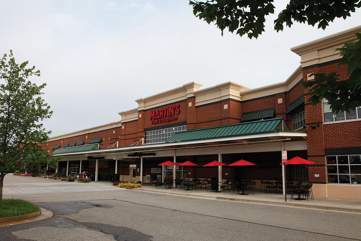
The divestiture pool was divided between the sizable, feature-packed and high-volume stores Ahold's Giant-Landover and Martin's (a banner of Giant-Carlisle) boasted, and the utilitarian, small town-friendly Food Lion chain in Delhaize's arsenal. Around Winchester, Martin's was the favorite to remain. Down south in Fredericksburg, meanwhile, Food Lion was poised to carry the mantle of the new corporation. While part of the plan suited each market, it did not stand without complications. Giant-Landover was a union-backed business, and protests demanded a reversal of the original plan in the Fredericksburg and Culpeper areas. Ahold and Delhaize reneged, meaning that Food Lion, instead of Giant, would be departing those cities. Despite numerous challenges, finding replacement stores was, surprisingly, no difficult task. Pennsylvania-based Weis Markets and SuperValu's Shop 'n Save banner subsumed Food Lions in the Fredericksburg/Culpeper and Winchester vicinities respectively. 

Down in Richmond, the plan was more clear-cut. It just so happened to be where Publix was testing the waters. If a hoard of north-central Virginia and the Shenandoah Valley grocery stores could trade hands easily, just imagine how the decision-making process went in a busier market.

A Ukrop's-turned-Martin's ("Martkrop's"?). Source: KBS

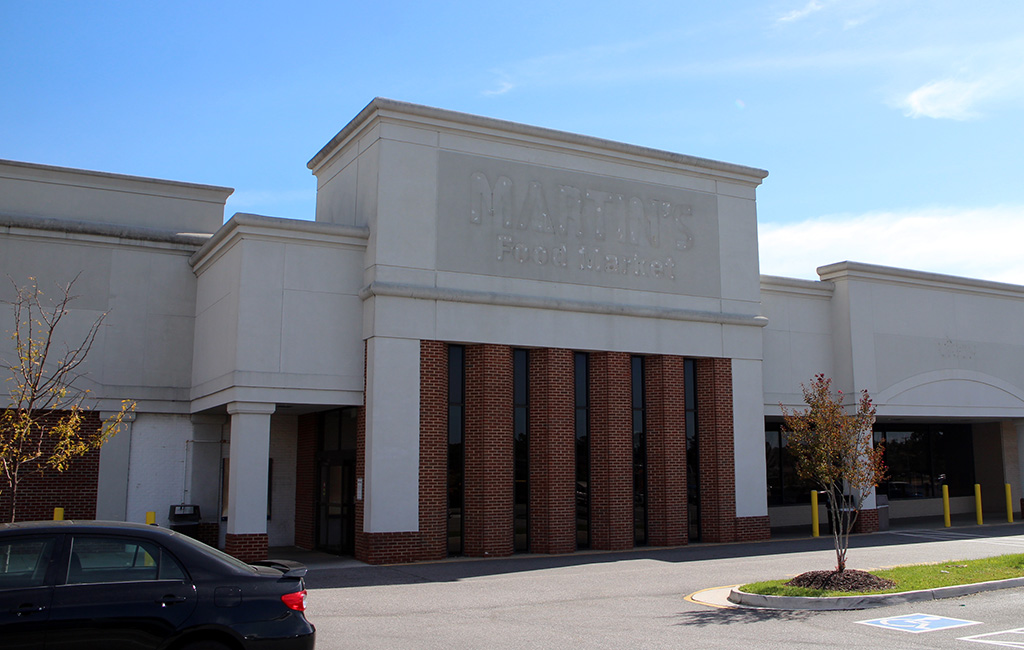
Martin's was in between a rock and a hard place in the River City. Ahold's interest in the market was the trophy of a 2009 bidding war over Ukrop's. The hometown icon had put their grocery business up for sale earlier that year, citing multiple factors. This included, but was not limited to, hardened competition from the likes of Kroger, Food Lion, and Walmart's Supercenters. After the bid was finalized, all Ukrop's would switch over to the Martin's name. Upon starting the conversion process, Ahold was tasked with patching Ukrop's competitive weaknesses. Some were easy to fix, such as instituting alcohol sales or opening doors on Sundays, two moves that showed a stark contrast in values. Other issues would prove far more complex, and Martin's position in the market only hampered progress.

The Richmond grocery market undergoing transformation. Source: Virginia Business


As the decade pressed on, the same issues that led to Ukrop's exit from retail only grew in intensity. Martin's was not as versatile as rival Kroger, and struggled to deter the no-frills standards the Lion and Walmart held. These challenges were compounded by Martin's failing to carry on the quality and recognition of its predecessor in many shoppers' eyes. Only one new store was built in the seven years Martin's operated in Virginia's capital, and several of their ex-Ukrop's holdings were shuttered during this time as well. With more competitors like Whole Foods, Lidl, and Wegmans steaming into town, something had to be done over at Martin's.

The decline of Martin's Richmond operations was happening right as their corporate parents were merging with their corporate rivals. As with points north, Ahold and Delhaize had multiple options to appease the FTC. Perhaps the only complicating factor in choosing what stores to let go was rooted in the busy retail scene, with the city boasting the most supermarkets in the country per capita. With the instability of Martin's and brand recognition, as well as wide spread (ranging from rural to suburban) of Food Lion, a clear winner was found. Former Ukrop's were again on the chopping block, not even a decade after the collapse of said chain. 

A Martin's (another "Markrop's", to be exact) that didn't make Publix's cut. Credit: Richmond BizSense


The aforementioned decision was compounded by the fact that both Martin's and Food Lion were non-union. This meant the preferred transaction could go through without vocal contention. All Martin's were put up for sale, and speculation heated up as to who would buy in. Some wagered Kroger would double up their presence. Such predictions ended when an intrigued Publix snapped up ten prime locations. Four more sites were added by year's end, readying the chain for an impressive launch. Closings and conversions soon settled in, with each Publix purchase being gutted and decorated to keep up with the chain's meticulous image. 

There would also be leftovers that did not go to Publix. As of 2024, most remain fallow or have been incorporated into non-grocery uses. These were likely not snapped up as the chain desired better locations nearby, or felt rebuilding these older locations would be less economical.

Virginia's first Publix. Source: Ryan (Flickr)

A Ukrop's-turned-Martin's-turned Publix ("Pubkrop's"?). Source: Ryan (Flickr)

Come 2017, Publix touched down in Virginia to much fanfare. The first several Martin's conversions would roll off the line that summer, with reopenings continuing into 2018. This batch of openings included the previously-announced Glen Allen store, itself a never-built Ukrop's. A few older ex-Ukrop's were also in line for demolition and rebuilds, showing Publix's construction prowess for all in Virginia's capital city to see. Publix is well-known for tearing down and building anew in its home state, so it's just what they opted for at those locations.

Fredericksburg, Virginia's first Publix. Source: Ryan (Flickr)

With Publix seeing success in the River City, they now had what it took to expand. There was a multitude of directions for Publix to go, though what most seemed desirable to them was Virginia's most important market, Northern Virginia. The first stop on their northwards journey would be in Fredericksburg, where they would secure a site at the southern edge of the city. Publix landed at the formidable Cosner's Corner power center, alongside Kohl's, Marshalls and (interestingly) a SuperTarget. That store opened in 2018, only one year into Publix's Virginia run. Despite giving the city of 27,000+ only one handle on the Publix phenomenon, the lone location still proved to connect with its residents; provided one could brave the Interstate 95 traffic to get there.

A true sign of the times. Source: Stafford County Economic Development

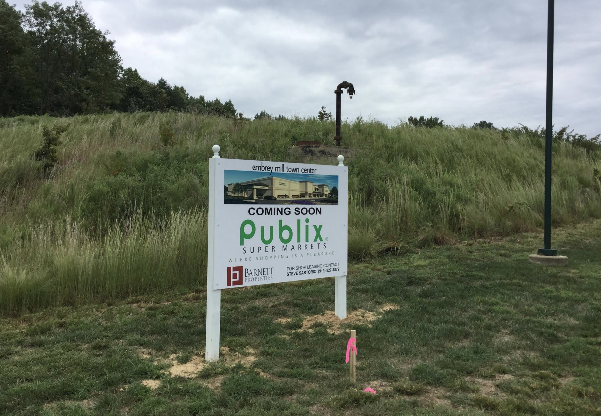
One year later, in July 2019, Publix one-upped their committment to residents of Fredericksburg. Their next store in the market was to be built in the northern suburb of Stafford. That store would be incorporated into the sprawling Embrey Mill development further up I-95, with a plethora of commercial space primed alongside an already bustling residential development. This post won't quite get into the construction process; though despite a 2021 target completion date, contractors put their best feet forward and the Floridian grocer opened its doors at the tail end of 2020. Since then, Publix has had a front-row seat to a blossoming retail development featuring acres of strip malls and fast food joints, and has managed well as an anchor in the Stafford community. 

Store Tour

I'm not one to end a story on an amateur note, but that is how Publix wound up 100 miles into the state of Virginia. With all that now in our rear view mirror, let's start this little tour!

The first photo of the tour segment is an alternate angle of the exterior. Here we can see the taller heights Publix has reached with their exteriors, which reflects something we are about to witness inside. I opine that this is an underwhelming design, with peach-colored brick slabs constructing the majority of the walls on each side. Now, how does the inside fare, exactly?

The first of the two interior views today is set in the mezzanine. This second-level space, featuring café seating for customers and employees alike, is perhaps the most defining feature of Publix's 48M format. With all that expansion into new territory, and continued growth in established markets comes new competition, and Publix certainly wanted to stand out from the rest of the crowd. Times in retail have changed as well, and their renowned collection of prepared foods has prompted a focus on in-store dining, especially as their e-commerce options have gained prominence. This café area reminds me of a similar layout Wegmans featured in their 1990s and 2000s builds. An apt reminder for sure, given the tendency for consumers to compare these two renowned supermarkets!

Moving beyond the dining hall, we have the left side of the store in the palm of our hands. To the right we have frozen aisles, while items like school supplies, pet food, and health & beauty occupy the middle. Elsewhere, we can see the dairy sign and beer and wine cache. While not visible, the bakery is in the back-left corner, while the pharmacy occupies the front-left. 

As it was then a new opening, I was impressed by the order and cleanliness abounding in each aisle. While I'm not a fan of the package (Evergreen) that decorates the walls either, I'm at least pleased to see it well-composed here. I especially liked the hanging drop ceilings, which add extra depth to center-store.

For the last photo, here's a look down the rest of the seating area. While it also conforms to Evergreen standards, the furniture composition isn't outlandish like some modern restaurants are, and the light fixtures appear tasteful. I think this setup can look just as neat with any good decor package. 

To the left of the picture, the standalone deli box (dubbed the "Deli Shrine" by Sing Oil Blog!) appears. In 48M Publixes, the deli is run entirely from a counter, as opposed to a kitchen-connected setup along the store perimeter that other Publixes have. This goes for whenever you're craving a signature chicken tender "Pub Sub" (Psst... there's a way to save on those) or you're stacking up on Boar's Head deli meats and cheeses. Either way, there's something for everyone on all four sides of the "shrine". Squished in between the deli and mezzanine is a great big round "P", marking the corner where customer service and online order pickup operate out of.

-

To sum up my first impressions on Publix, I would say that it was a great place that knew just how to be high-volume and feature-packed while appearing humble with its smaller store sizes (in comparison to recent competitors). Publix sure knows how to place the best of both worlds into a little package! I also like how this store strategically held out as a testing bed for the busy Northern Virginia retail market, all while being anchored to the more bountiful resources originating from places south.

-

Thank you all for reading through! Next time, I will be returning to the place where shopping is a pleasure (did I get that right?), and dissecting some major details about Ukrop's and Martin's combined history in Richmond, as well as Publix's escapades elsewhere in the Old Dominion. Be sure to tell your friends all about this blog and sound off in the comments. 

How do you think Publix is getting by in Virginia, especially this far north? What do you see them doing there next? This post also marks the beginning of a new, narrative-centric format. What should I improve about this along with my writing style?

Disclaimer: I have no opinion on the union situation. I included such details merely to show that these matters played a role in the Ahold-Delhaize merger.