...and again, welcome back to the Shoppes of Battery Mill, where (yet again) blogging is a pleasure!
As they say... and now, for something completely different. What you are seeing here is the first edition of my Retail Ranking series, where I count down and review elements of retail design and business, from worst to best! I have started this series as it gives me a chance to examine these characteristics and determine what sticks, what doesn't and why, as well as to reflect on retail memories. For the inaugural installment, I will be taking a look at Florida's crown jewel, Publix Super Markets and examining its interior decor packages.Why Publix, exactly? Before I answer the question, I will admit I have little history with this chain, as it thus far exists only on the fringes of the Washington, D.C. area, this blog's main region of coverage. This reason is actually a contributing factor as to why - rumors have been swirling over the past several years, and the existence of Publixes in peripheral cities Fredericksburg and Stafford, as well as the rest of Virginia only adds to the winds of speculation. I would be excited to see how the chain adapts to Northern Virginia, Maryland, and the District in terms of design. Moreover, I have also been captivated by the work of Albertsons Florida Blog, My Florida Retail and Sing Oil Blog, among others, in documenting Publix. If you like retail history, or want to check out something new, definitely visit their blogs! Therefore I thought Publix would be a great choice, as their decor packages have all had their strengths and I am ready to check them out in detail. As for chains with an existing presence on here, such as Giant, Shoppers, and any national retailers: They will be on the way soon, so keep on the lookout!
Before I begin, I have a few other disclaimers about this list. The first is that I will remain constructive in my criticisms; I respect the designers behind these efforts. Another is that you are free to write such a ranking for your own blog, whether from Publix or from any other retailer. I am open to your own interpretations! Lastly, I am going to keep it simple for this one. That means no scoring or tier systems.
Criteria-wise:
- While I will be focusing on decor packages, I will not be detailing their corresponding layouts for new-builds, except for how they adapt to those as compared to older packages.
- This list will not take into account mid-cycle revisions and other minor alterations made to the packages over the course of their run.
- While numerous photos have surfaced, I do not plan on adding pre-1990 Publix interiors (sometimes known as "Florida's Market") to the roster, as their histories are not complete enough yet.
- Neither will I be including one-time decors or those from Publix spin-offs such Sabor and GreenWise Market, as I want to keep the analysis strictly to the main brand.
Now, with all that being said, let's start with my least favorite:
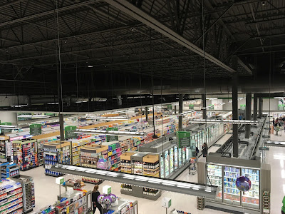
#7: Evergreen (2019-present)
Evergreen is Publix's current decor package, featuring polished accents, textured walls, and an overall gray theme across the store.If you've been keeping up with the retail industry lately, you know gray paints and wooden accents have been showing up on every street corner like Mattress Firms or Kelpshake cafés. I'm certainly not a fan of that, and this is the primary reason why I've ranked this package so low. To me, it feels like Publix is latching on to industry trends, and this package just does not feel very personal, rather corporate and overly-millennialized. It's strange why Publix has decided to go this route after making timeless decors beforehand.
Evergreen especially comes off as mediocre in remodeled stores. The specific textures new-builds have are not present in older locations, and the color palette clashes with the multi-colored appliances and light ceilings of past packages. Simply put, it does not adapt as good as its predecessor in Sienna, as you will see later.
However, not everything I will say about the package is negative. The green accents add a little pop, and the wall textures, as well as posters, contain the grayness somewhat. Thanks to the strategic lighting and lighter-overall walls/wood accents, Evergreen also has a slight warmth to it that its contemporaries across retail might not be able to attest to.
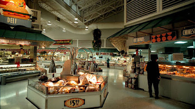
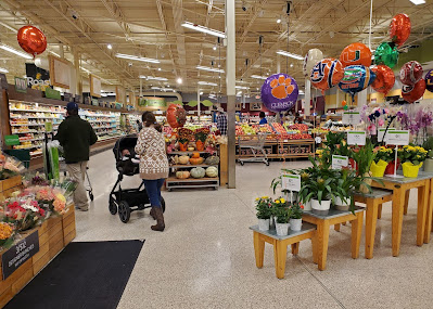
#6: Kiwi/"Classy Market 1.0" (2001-2009)
 |
| Credit: Brian Kirsten (Flickr) |
 |
| Credit: R M. (Yelp) |
In new stores, Publix did a great job contorting the walls to induce scale and give off a feeling that you are at an open-air market. The crown mouldings, arches, and shutters help to elevate luxury status at any Publix with this design.
Kiwi does not look impressive in older stores, where Kiwi's colonial facades were typically not optioned. This is why I have ranked the package so low. Nevertheless, its friendly nature creates an appetizing environment, with the tones and tints bleeding Publix green.
#5: "Wavy Pastel" (1990-2005)
 |
| Credit: The Miami Herald |
This package, to me, is certainly a treat; nostalgic, yet ahead of its time and promising for the future. What this package has over its predecessors is that it is a tad more colorful and has bolder signage. It also tends to be better composed in remodeled stores compared to Kiwi.
I feel that Wavy Pastel gives off too much of an empty feeling at times, with its expansive stretches of white walls just above perimeter coolers. Granted, retail design has advanced since the 1990s, but it still drags the package down my list slightly. I would have also included a tad more green, so that this package would have been even more memorable.
#4: "Metallic Marketplace" (1999-2005)
 |
| Credit: kaytee17 (Flickr) |
In my opinion, Metallic Marketplace is a testament to graciously improving upon a prior concept. What I like was the corrugated metal textures, strong use of overhead elements and neon, and the modernized signage that carried the successful Wavy Pastel philosophy into the next decade. Some of these are quite a rare sight in present-day grocery design! What drags this package down are some of the traits it shares in common with its predecessor, though such is made up for in the final three packages on my list.
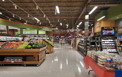
#3: Bamboo/"Classy Market 2.5" (2009-2015)
 |
| Credit: Sing Oil Blog for Albertsons Florida Blog (Blogger) |
This major update to the previous Invigorate refined department signage, keeping it up to date with the minimalism of the 2010s.
What I appreciate about this package, that places it among my top 3, is that it is perhaps the most colorful design of anything that comes before on this ranking. This is certainly what helps Publix compete with other grocery retailers that have had less constrictive personas, and brought upon a special touch to each department rather than uniformity. Not to mention, it fit well into any stores it was remodeled with, moreso than the past 4 packages.
#2: Invigorate/"Classy Market 2.0" (2006-2010)
 |
| Credit: The Stewart/Perry Companies (Flickr) |
 |
| Credit: Albertsons Florida Blog (Blogger) |
A return to colorful vibes following the more upscale 1.0 version, the second installment of Classy Market brought about number of signage pieces of all shapes and sizes.
What places this package over its successor to me is that departmental signage is more detailed, and that other elements are simply more down-to-earth, with lighter colors and a more consistent framing of each department (including that customer service desk on the left!). Otherwise, I would say just about the same things.
#1: Sienna/"Classy Market 3.0" (2010-2021)
 |
| Credit: Sing Oil Blog (Blogger) |
What can I say except this is my favorite era of Publix? The continued "dynamic department" approach gives off just the right vibe for each section of the store. Specialized pieces, such as the swooping produce sign, sprinkles of bright green, and polished stone, metal and wood (although in moderation) only helps to show Publix's committment to their design philosophy. The walls pop with their colorful, yet simple blocks of department signage. Textures such as the wine canvas and pharmacy tile are small details, but add a new space of depth to each department. Not to mention, these balances make this package quite easy to adapt to Publix stores of any vintage, which can appear colorful and modern without needing to send in the carpentry crews too often.
The only flaw I see is that it appears a tad dark at times - otherwise the color makes up for that.
-
Thank you for following along with this ranking! I can't wait to hear your thoughts on it. More will be on the way, so stay tuned!
-BatteryMill


I totally forgot about Kelpshake until I read this post!
ReplyDeleteAnyway, as for the rankings, I think yours are fairly similar to how I would have ranked these packages, although I probably would have bumped up Wavy Pastel a bit higher, probably to the #2 spot instead. Like CM 3.0, I feel Wavy Pastel was a pretty iconic, quite widespread decor for Publix, and that decor became ingrained with the chain's image for years. The walls were white in places, but I don't remember being in a Wavy Pastel store where the walls came off as being too blank. I was not a fan of CM 1.0 when it first came out, probably because of how stark of a contrast it was to the more whimsical feel of Wavy Pastel and Metallic Marketplace. I've warmed up a bit to the design of CM 1.0 though over the years, and it was a nice decor overall. Evergreen though is really hit or miss with remodels - it looks fine in some stores (and surprisingly, it doesn't look horrible in the 1970s and 1980s stores), but sometimes it just doesn't look right in some buildings. I've yet to find a CM 3.0 store where that decor just seemed a bit off.
Also, I've never seen that CM 2.0 customer service sign before, however, I don't think I was ever in a newbuild CM 2.0 store while it had that decor.
Well, interesting that you got the reference! I certainly remember that
DeleteI can see the whiplash CM 1.0 brought about, nevertheless it's become a solid corner of Publix history. The banners and awnings do help to break up the monotony, and it is a better approach than what the preceding implementations of Florida's Market brought about. Maybe if I ever take a visit (or a VR tour) to an unremodeled Wavy Pastel that could change things around.
I do like how colorful that piece was, I would love to get ahold of it for some reason!
First of all, thanks for all of the links! It has been interesting to see how much you have learned about a chain that you have only visited one store of (compared to the who knows how many I've seen). I know I wouldn't have been able to do such!
ReplyDeleteI feel like every interior, whether modern or not, has latched onto the larger retail trends of the era. Just look at Wavy Pastels with the bight Floridian colors of the 1990's or Kiwi with its muted tones from the 2000's.
Anyway, here is how I would rank mine:
Sienna / Bamboo (Tie):
A 54M that was built with either Sienna or Bamboo is probably one of my favorite Publix stores to walk through. Since both packages were developed simultaneously, it is hard for me to just pick one because they both have their strengths. #1427 (whose produce department picture you included) looks really good with the package, while its sister up the road, #1498 also looks amazing with Sienna. Where Bamboo excels ahead of Sienna is in cheaper remodels since the former has more accent signage that would otherwise lead to flat, empty wall space in the latter (some of the Pub-Dixies or Publixsons I've seen with Sienna come to mind). Cheap Bamboo installs also leave behind plenty of fun nuggets for me to dig up! As for Sienna, the very early premium installs are fantastic. You'll just have to wait until I share more of those in the coming months . . . At least my post on #720 is a fine example as well. I also love how consistent the department signage is with both packages.
Wavy Pastel:
I'd disagree that Wavy Pastels feels empty, considering how even most retrofitted stores received accent awnings and the colorful banners. The photo you linked to from the frozen section just shows the front left corner of an old expanded store that would likely look boring with any Publix package (no package that I can think of adds ordination to the frozen department other than a little wall paint and a basic sign). When seeing a store in person, the louvers and awnings add so much texture that you forget about the walls being white. The signage also adds just enough color to make the space feel interesting without being busy. It is quite the effect to see a new-build WP store that still has all of its original awnings in place (and those awnings work really well with Evergreen).
Evergreen
I think it's funny that you linked to my picture from the Albany Publix as being a bad example of Evergreen becasue other than the all green aisle signs, the store didn't look that bad. I think #1363 is a much worse example with its mustard freezers and brown ceiling or #1306 when it still had its CM 2.5 tile patterns on full display (they have thankfully since been covered by white vinyl). I agree that Evergreen doesn't adapt as well as Sienna, but there are some cases where it looks amazing in older stores. I would highly recommend visiting a 45T with Evergreen—I think it may look better than a new-build. It helps that Classy Market 1.0 was a relatively boring package to start with, so the 45Ts have extra elements that newer stores lack.
Invigorate:
While this is the package I have the closest relationship to (considering I own the last example of it), it feels like something that needed the polish CM 2.5 brought. The older plastic produce displays and other fixtures also made many installs feel cheap. Heck, just look at how cheap many of the Albertsons conversions were. As bad as Evergreen can look in stores like #582, I still think as a whole the package has experienced a better rollout than Invigorate. That being said, Invigorate still isn't a bad look when done right.
Metallic Marketplace
DeleteAgain, this package looks really cool in purpose-built stores; however, it is a bit over the top and just comes off as haphazard in the few remodels I've seen. The bare corrugated metal also leaves an unfinished look. It also throws me off every time I see the mint green air ducts against the white ceilings. Even today, it is easy for me to recognize a MM store when I walk in because the air ducts are gigantic compared to the newer store designs. MM also has a lot of loud colors that can clash like the dark green vs the teal used on the aisle signs.
Kiwi:
Bland City. Like you mentioned, this package didn't translate well to older stores that lacked many of the architectural accents. This also may be because I haven't experienced a new-build Kiwi store in over a decade, but even those just had random shutters attached to the wall for decoration. At least the crown molding was nice and the package wasn't offensive.
You're certainly welcome! Let's focus on leveling one another up, this is a great to start. Soaking up retail history is definitely something I have a thing for, and I'm certainly building up my experience with Publix, at more than just one location.
DeleteI can certainly agree about that, it's just that the gray/faux wood themes common since the mid-2010s is likely more sweeping across the retail scene and probably the lamest of all trends in my opinion.
I do like many purpose-built stores from both package, but personally 49M Siennas and 45M Bamboos strike the right chords for me. Even though I prefer the post-2013 Sienna, which is better-compose and more palatable to any model of Publix new and old, I still can't wait to see what that has to hold. The consistency of departmental signage is something retail designers should take notes of.
I've seen emptier, and it's got some detailed moments, but I'll argue Wavy Pastel does have some blindspots to decor, especially in stores with taller ceilings over the grocery aisles (see the wall over the grocery aisles in "Publix's Waviest Hour"). It definitely would have looked better in person I think.
For your Evergreen example I will say the facades where signage is perched on top of don't look bad, but I dislike the implementations where the rest of the walls are covered by splotches of dark gray paint, in addition to the mismatched-color fixtures. The package does go well with 45T/55Ts though, I agree it is the best example outside native purpose-built locations.
With Invigorate I liked the departmental signage better than Bamboo. Bamboo's largely consist of slatted walls, small icons and text in an organized fashion, whereas there were more dynamic textures in Invigorate, interesting shapes and secondary pieces, all of which melded together well.
Kiwi's also a shame since the decorative elements were taken out when it was time to remodel to Sienna/Evergreen. Not much to say about it but it's still pleasant to the eyes.
If the past is any indication, the good news about boring trends sweeping through society is that wild and vibrant ones are just over the horizon. Have faith, and I'm sure we will see more interesting designs unveiled.
DeleteThe 49M Siennas are a nice choice. It is probably since I'm more familiar with the 54Ms that they are top of mind for me, but I'd agree that the 49M takes the best parts and levels them up by adding the specialty cheese counter. As for the 45M Bamboo stores, they aren't bad; however, a 45M with anything just feels generic after all of this time.
That's a fair point about the lower ceiling section over the grocery department in 55N stores. I never saw one of those in person with the package, so I can't speak as to how it looked "in the moment". At least all of the hanging ferns added something to the larger WP stores!
I'm glad we agree about the 45T/55Ts! They are really nice looking stores with Evergreen!
I am a big fan of dynamic consistency (if that is even a thing), so I think that's why Bamboo resonates with me better than Invigorate. I do appreciate the curvy signs with Invigorate, however, and the seafood departments in new-build stores looked really cool.
I do hope we know when retail designers start thinking outside the box and use bright colors + a variety of wall textures again!
DeleteI prefer 49Ms as they are more cozy (so is the cafe), but 54M looks just as good despite its more voluminous size. Being a hybrid between the Sienna Hybrid and standard 45Ms of the time I found the 54M Bamboos to be a weird middle-ground, still fine but I say Invigorate and Bamboo executed the 45M size the best since it had shapes no other package has ran with.
I do like Bamboo as well, I feel like the Seafood department looks better than Invigorate, but I'm still on team Invigorate. To each their own.