Welcome back to the Shoppes of Battery Mill, where low prices are only the beginning! Today we cap off Shoppers Week with a look back at a now long-gone Shoppers store.
Cover photo taken October 3, 2017 by BatteryMill
Store information
Address: 9540 Liberia Avenue, Manassas, Virginia 20110
Shoppers
- Store number: #2381 (current), #74/#2674/#052074 (former)
- Opening date: August 25, 2004
- Closing date: August 21, 2016
- Decor package: Fresh & Healthy 3.0
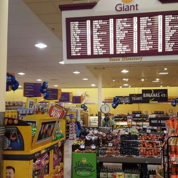
- Features: Deli, Meat & Seafood Counter, Bakery, Beer & Wine, Shoppers Café, Pharmacy
Fresh World
- Address: 9540 Liberia Avenue, Manassas, Virginia 20110
- Opening date: November 18, 2016
- Decor package: (Shoppers) Fresh & Healthy 3.0, modified
- Features: Deli, Meat & Seafood Counter, Bakery, Beer & Wine, Shoppers Café
For the fifth and final installment of Shoppers Week, we find ourselves back at the former Liberia Avenue Shoppers in Manassas. This is another location I have covered previously, especially just after closing. However, this is still a busy part of town, and likewise, such an area with prime real estate is bound to continue doing business even after the chain declined under SuperValu's ownership and left. While the site was quickly taken over by international chain Fresh World, not only has the store been continuously running, but there have been significant changes conducted inside and out since.
Yet, the ghosts of Shoppers past continue to lurk within the store's bounds. What are they, exactly? How have the new building owners adapted to it? What else is there to see? We'll find out shortly.
Store history
 |
| The store, ca. 2006-2008. Credit: Tri-Tek Engineering |
The Shoppers store's existence rested at the confluence of a fast-growing supermarket chain and a rapidly suburbanizing environment. At the turn of the millennium, Shoppers had wound up under the mighty wholesaler SuperValu and lost some of its original identity, but was still determined to continue their hot streak. Strategic moves like the acquisition of four former SuperFresh (A&P) locations, expansion to Baltimore by means of replacing sister brand Metro, and the continued renewal of existing stores was buttressed by entirely new locations in growing suburbs.
While this wave of phenomenal growth was taking place, Shoppers was already running two locations in Manassas. One was located at the sprawling Bull Run Plaza across town, while another, smaller shop operated at the Maplewood Center along Route 28. Both Shoppers were located within established retail districts in town, with other mom-and-pops and big boxes alike serving hundreds of homes. There was, however, one quieter part of town that would come to the interest of Shoppers Food Warehouse. The eastern side of town, previously removed from Interstate 66, Fairfax County and job centers was about to burst onto the scene.
As soon as conditions were right and space was exhausted on the Sudley Road (bus. VA 234) corridor, new homes started springing up everywhere east of the railroad tracks. Subdivisions encroached on what were once forests and fields. The addition of new transportation networks like the Prince William Parkway (VA 234/294) and the Virginia Railway Express (VRE) also gave a needed jolt to this once sleepy corridor. Liberia Avenue, the road this development occurred on, was also transformed from a 2-lane bypass of Old Town into a 6-lane commercial street. Finally, it was time for retail buildings to rise.
Several developments existed on Liberia beforehand, such as the Davis Ford Crossing center anchored Weis Markets and Staples. However, there was still room for retail and restaurants that could draw audiences in more than a neighborhood, grocery-anchored center. Logically, various chains started making their moves.
Walmart opened across the street in August 2003, beginning a new era for the strip. The Signal Hill Shopping Center, featuring Shoppers, was announced in November of that same year. At last, Shoppers opened their doors in August 2004. Chains such as GameStop, Chick-Fil-A, and Panera Bread quickly followed suit in the same center.
Just as Shoppers set up shop and fed into a cycle of growth along the corridor, a monkey's paw would emerge. The arrivals of Aldi and Harris Teeter, as well as Walmart's Supercenter expansion dealt blows to what was previously the most dominant supermarket on this street. Shoppers' chainwide backslide throughout the 2010s did not cease investment, however. The store underwent a remodel in late 2011-early 2012, updating to SuperValu's Fresh & Healthy 3.0 decor package. Yet, reported lease issues and a transfer of the shopping center from original developer Regency Centers to JCR would be the Achilles' heel for this once prosperous shop. Shoppers would shutter here in August 2016, following rumors circulating since early in the year and the in-store pharmacy closing a few months earlier.
Soon after closing, local international food chain Fresh World stepped up and assumed the space. In November 2016, after some slight work, the two sets of doors on each side of the store were swung open once again. Fresh World has tinkered with the store over the years, adding and modifying departments. Still, a few spectacles remain from Shoppers' past, as we shall see in this post.
This is a story in three parts. One visit from 2020, another from
2023, and now one in 2025 have all chronicled the goings-on at the
Manassas Fresh World after taking upon the Shoppers mantle.
Store tour
January 8, 2020
We kick things off in a rather unlikely place: the restroom. I'm not sure if this was redecorated at any point, as it does not resemble the bathroom at the Dumfries Shoppers, though we do see something that dates back to the Shoppers days - one peculiar sign. Keep on reading to see if these findings become a theme.
Next, we head over to the international aisle. While this store is largely comprised of international foods now, there are still plenty
This aisle still stands to international foods though, as I do recall it takes from a variety of countries (though this store is largely Hispanic-oriented, given the strong local Hispanic community here).
The sign itself was installed chainwide at Shoppers in 2015. Sadly, this meant that a lot of the cool overarching department signs were taken out.
Aisle 12 time! It's always interesting how new chains that move in replicate the old tenant's style with markers like these. Shoppers' aisle markers remain, albeit some are quite faded now.
Something else seen in the photos are those burnt out lights. Throughout this set, it will be a recurring sight throughout that many ceiling lights have burned out, or are on the verge of losing their spark.
Now we glance over at what was once the health and beauty department in Shoppers' time. This place, as of 2020, hosts a scattershot mix of merchandise ranging from paper towels to condiments, and baby food to portable appliances. Yet, the lower gondolas from Shoppers and gooseneck signs still hang on.
Beyond the aisles, though before the former pharmacy space, we can witness a green crown moulding. Underneath are a few spaces reserved for stores-within-stores, though none were occupied at the time. These were constructed by Fresh World, and I find it interesting that the paint colors match what Shoppers put in. In the far background, the front end of the store stands.
From the Vineyard... we can see a model windmill, some bottles of corn oil, and a few fixtures scattered in this corner that once hosted alcohol products from around the world.
June 12, 2023
Jumping ahead to 2023, we see Fresh World's cart collection. I must say, these are well-polished (reminding me of what TJ Maxx/Total Wine have in their fleet). Shoppers' cart sign is another artifact that survives. How lucky!

We enter the interior, all to witness another Shoppers-era classic. This one's just a small trash can helped by an external set of wheels. How convenient!
It might not be branded "floral" anymore, but we still can buy things that come from flowers here! To the right you can peek at Shoppers' old "Saving Zone", and the slatted floral walls survive. The entire floral cooler has been dismantled to the left, leaving an open wall between the perimeter and the Shoppers Cafe.
Fresh and ready veggies for you and for me! Again, here we have a category marker left over from Shoppers. It's interesting how sometimes, they don't elect to take out small items like these. Other than that, one can tell the ceiling lights have burned out here - things were much brighter when Shoppers was here, that's for sure. Though this could very well be a stylistic choice, too.
Moving across the "grand aisle", we turn up on the Seafood shores. While sticking true to its promise, restaurants run by outside tenants have operated here, including to the left. We see several more Shoppers throwbacks here, including those ca. 2009 departmental pennants (pictured in orange), the multilingual department banner, and the unearthed "sea fresh" sign from Shoppers' storage.
Under the lowered ceiling, none of the previous deli grab and go/fountain counters exist anymore, replaced by pallets and displays. What we do have here, however, are tanks larger than what Shoppers had to offer in their day.
As previously discussed on this blog, Shoppers' Fresh & Healthy 3.0 remodels homogenized the once colorful tile floors of stores with the mid-2000s "Real People. Real Value. Real Smart."/"Smart Shoppers Shop Shoppers" decor package. This example, however, eked its way into the remodel. Perhaps it might have been because this particular implementation had no sign, or maybe they forgot to change out tiles. But hey, I'm just speculating.
Bread... or wine... or beer? Entering the bakery, it seems Fresh World has done a reset to move their alcohol products here. Poetic, in a way.
Fresh World and Shoppers signs collide outside the bakery/lunchmeat alcove.
Zipping through International, we witness the changes to this department. During Fresh World's time, this aisle has appeared plainer than what Shoppers had in its time.
I believe the drink coolers are a post-Shoppers addition. One other thing that does still stand from Shoppers is that black and teal departmental sign, as of 2023.
Now, we take a look at the meat department. This is perhaps the most
unchanged part of the store from the Shoppers years, with only minimal
fixture swaps and signage changes.
Aisle 12, we meet again! As we approach Frozen and the left side of the store, we take a look at what departmental changes Fresh World has made. This place is now home to some different merchandise, now that the Dairy sign has been dismantled, that being spices and chips.
Finally, we are in the corner of the store. Throughout most of Fresh World's tenure, this part of the store has almost never been set up for customers to shop in. From my recollection, it either has been filled with pallets or simply full of empty and turned-off freezers.
Looks like the "infinity cooler" has been sadly made finite.
Somewhere along the left side of the store (don't remember where this was; likely near frozen), a large chunk of Shoppers history lurks: the slatted wall. Once adorning stores all over, the chain made sure to wipe out nearly all traces as stores progressively remodeled. Yet, they just couldn't help but hold on to this one!
We turn our attention to the former health & beauty department's environs. Nothing much has changed here, though I'd argue it's a little cleaner than previously.
The former beer & wine corner, now stuffed with more fixtures than before.
Beyond the Bounty, we can see a glimpse into the former bank space. This started out as a Provident Bank and converted to M&T Bank when these chains merged in 2009. Largely underutilized since 2012, when M&T quietly closed most of their Shoppers in-store banks, it appears to have been rented out to other tenants for a time during Fresh World's tenure. See what you can find from those Provident/M&T Bank days!
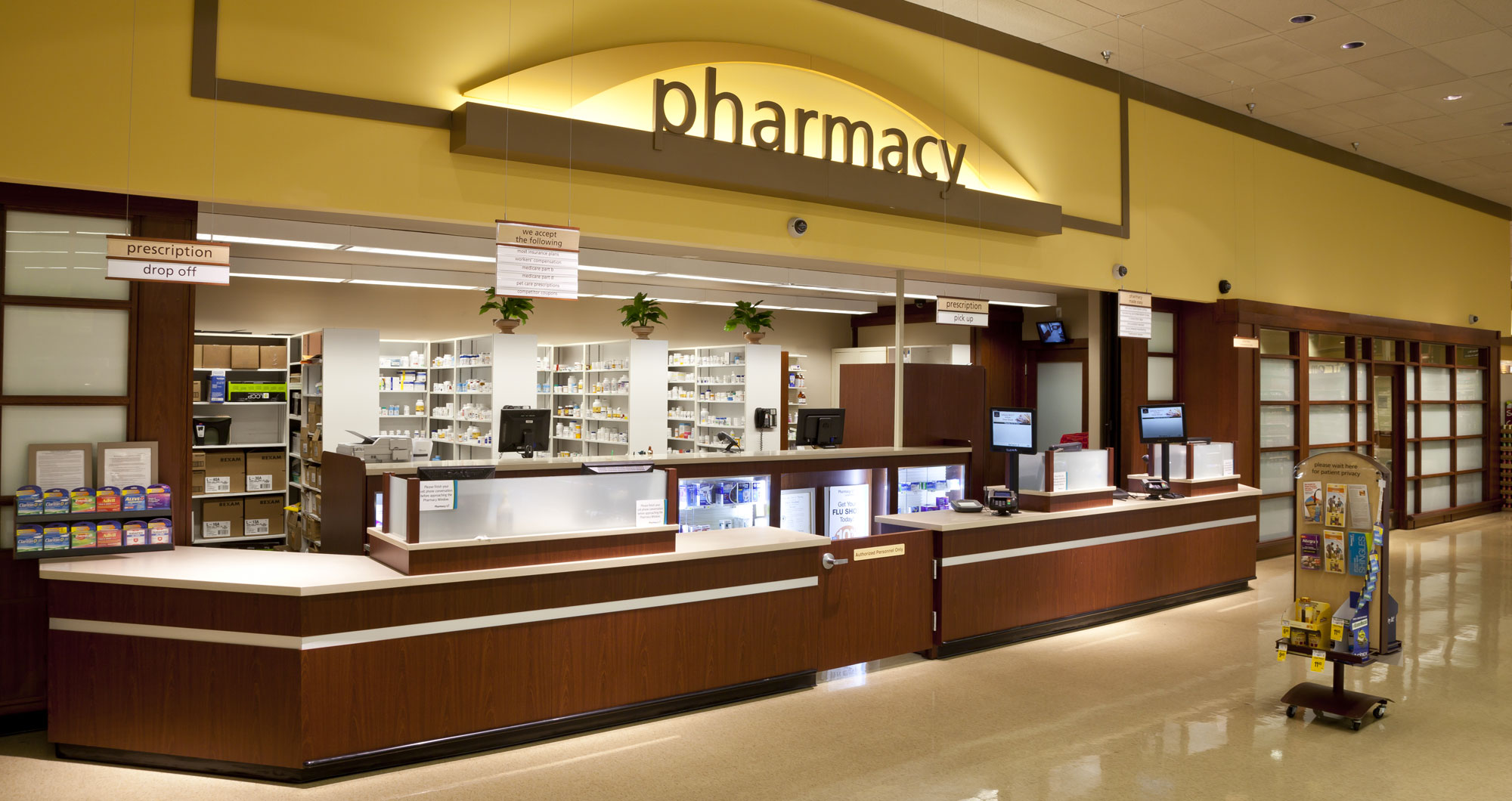
Here we see the former pharmacy, with blue-light cases and frozen food coffins, as well as the lattice doors strung down. This looks to have been a store-within-a-store at some point.
Store-within-a-store setups are common fixtures at international supermarkets like this one. These range from sportswear shops, to financial services, to travel agencies and more. It's something eclectic that I definitely wish was replicated more often in conventional American supermarkets!
Would you look at that? Another Shoppers relic, this one stuck on one of the old pharmacy doors!
To the left are some of those underutilized store-within-a-store spaces discussed in the 2020 chapter.
Essential Everyday in the 10th aisle! Hard to believe these are just about the same products you could get here 10+ years ago. Current owners UNFI distribute to a lot of independent shops, yes, but this is crazier to think about.
June 21, 2025
Construction work? Where could Fresh World be steering their boat towards? Well, it appears that the space is being subdivided.
When I visited last year, I was puzzled by the addition of a new wall near where pharmacy/dairy/frozen were located. I had thought that it was temporary, or that it was just Fresh World reserving said space for more backroom storage. Turns out, the shopping center's owners have chosen to sublet a chunk of the store to potential new business, and Fresh World has adjusted accordingly.
In the next photo, we'll see what it looks like on the inside.
I could tell Fresh World was done with that space as years of continuous disinvestment made the pattern clear. The potential tenant spaces that were in front of the Shoppers pharmacy weren't being filled either, so it was high time to consolidate. I could also tell that no doors on the salesfloor existed into this area, so it was lights out for the space. A shame it is indeed that we might not be getting this store in its entirety ever again.
Fortunately, we have a few Shoppers gooseneck frames intact, with a few of the actual signage slips holding strong, too.
Around the old pharmacy, Fresh World has built spaces for tenants displaced by the store's downsizing. Only two of the projected six tenants have entered so far, with the rest being used for Fresh World stock.
Now, where would frozen foods go? Near International, apparently. I'm pretty sure this is where frozen foods have been since the store relaunched as Fresh World. These look to me like old Food Lion/Bloom coolers based on the structure and color.
Conclusion
What surprising changes Fresh World has undertaken to one of the Washington-area titans' former stores! International stores are treasure troves of grocery retailing past, and you'll never know just what to expect at them. Speaking of the store itself, I'll make sure to keep a tab on what comes next to the center.
That being said, thank you for reading through Shoppers Week! I will be posting content from other retailers in the coming weeks. More Shoppers-related content will still be posted as well, so keep your eyes out for that! Last but not least, I certainly wish Shoppers all the best as they plan their next moves under UNFI. Good luck to this historic D.C. area retail chain!
Bonus: I won't be placing a bonus photo today, but I have a video related to the topic. Here is a view of the store as of 2010, before the remodel! (warning: language)


