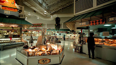
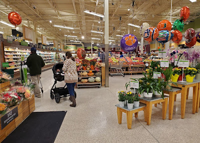
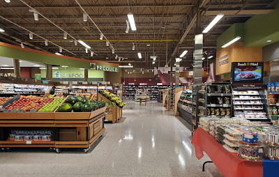
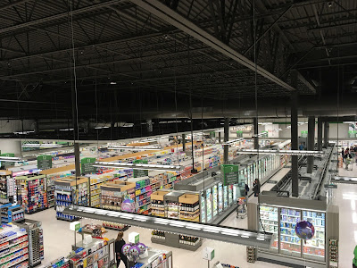
...and again, welcome back to the Shoppes of Battery Mill, where (yet again) blogging is a pleasure!
As they say... and now, for something completely different. What you are seeing here is the first edition of my Retail Ranking series, where I count down and review elements of retail design and business, from worst to best! I have started this series as it gives me a chance to examine these characteristics and determine what sticks, what doesn't and why, as well as to reflect on retail memories. For the inaugural installment, I will be taking a look at Florida's crown jewel, Publix Super Markets and examining its interior decor packages.Why Publix, exactly? Before I answer the question, I will admit I have little history with this chain, as it thus far exists only on the fringes of the Washington, D.C. area, this blog's main region of coverage. This reason is actually a contributing factor as to why - rumors have been swirling over the past several years, and the existence of Publixes in peripheral cities Fredericksburg and Stafford, as well as the rest of Virginia only adds to the winds of speculation. I would be excited to see how the chain adapts to Northern Virginia, Maryland, and the District in terms of design. Moreover, I have also been captivated by the work of Albertsons Florida Blog, My Florida Retail and Sing Oil Blog, among others, in documenting Publix. If you like retail history, or want to check out something new, definitely visit their blogs! Therefore I thought Publix would be a great choice, as their decor packages have all had their strengths and I am ready to check them out in detail. As for chains with an existing presence on here, such as Giant, Shoppers, and any national retailers: They will be on the way soon, so keep on the lookout!
Before I begin, I have a few other disclaimers about this list. The first is that I will remain constructive in my criticisms; I respect the designers behind these efforts. Another is that you are free to write such a ranking for your own blog, whether from Publix or from any other retailer. I am open to your own interpretations! Lastly, I am going to keep it simple for this one. That means no scoring or tier systems.
Criteria-wise:
- While I will be focusing on decor packages, I will not be detailing their corresponding layouts for new-builds, except for how they adapt to those as compared to older packages.
- This list will not take into account mid-cycle revisions and other minor alterations made to the packages over the course of their run.
- While numerous photos have surfaced, I do not plan on adding pre-1990 Publix interiors (sometimes known as "Florida's Market") to the roster, as their histories are not complete enough yet.
- Neither will I be including one-time decors or those from Publix spin-offs such Sabor and GreenWise Market, as I want to keep the analysis strictly to the main brand.
Now, with all that being said, let's start with my least favorite:
#7: Evergreen (2019-present)
Evergreen is Publix's current decor package, featuring polished accents, textured walls, and an overall gray theme across the store.If you've been keeping up with the retail industry lately, you know gray paints and wooden accents have been showing up on every street corner like Mattress Firms or Kelpshake cafés. I'm certainly not a fan of that, and this is the primary reason why I've ranked this package so low. To me, it feels like Publix is latching on to industry trends, and this package just does not feel very personal, rather corporate and overly-millennialized. It's strange why Publix has decided to go this route after making timeless decors beforehand.
Evergreen especially comes off as mediocre in remodeled stores. The specific textures new-builds have are not present in older locations, and the color palette clashes with the multi-colored appliances and light ceilings of past packages. Simply put, it does not adapt as good as its predecessor in Sienna, as you will see later.
However, not everything I will say about the package is negative. The green accents add a little pop, and the wall textures, as well as posters, contain the grayness somewhat. Thanks to the strategic lighting and lighter-overall walls/wood accents, Evergreen also has a slight warmth to it that its contemporaries across retail might not be able to attest to.
#6: Kiwi/"Classy Market 1.0" (2001-2009)
 |
| Credit: Brian Kirsten (Flickr) |
 |
| Credit: R M. (Yelp) |
In new stores, Publix did a great job contorting the walls to induce scale and give off a feeling that you are at an open-air market. The crown mouldings, arches, and shutters help to elevate luxury status at any Publix with this design.
Kiwi does not look impressive in older stores, where Kiwi's colonial facades were typically not optioned. This is why I have ranked the package so low. Nevertheless, its friendly nature creates an appetizing environment, with the tones and tints bleeding Publix green.
#5: "Wavy Pastel" (1990-2005)
 |
| Credit: The Miami Herald |
This package, to me, is certainly a treat; nostalgic, yet ahead of its time and promising for the future. What this package has over its predecessors is that it is a tad more colorful and has bolder signage. It also tends to be better composed in remodeled stores compared to Kiwi.
I feel that Wavy Pastel gives off too much of an empty feeling at times, with its expansive stretches of white walls just above perimeter coolers. Granted, retail design has advanced since the 1990s, but it still drags the package down my list slightly. I would have also included a tad more green, so that this package would have been even more memorable.
#4: "Metallic Marketplace" (1999-2005)
 |
| Credit: kaytee17 (Flickr) |
In my opinion, Metallic Marketplace is a testament to graciously improving upon a prior concept. What I like was the corrugated metal textures, strong use of overhead elements and neon, and the modernized signage that carried the successful Wavy Pastel philosophy into the next decade. Some of these are quite a rare sight in present-day grocery design! What drags this package down are some of the traits it shares in common with its predecessor, though such is made up for in the final three packages on my list.
#3: Bamboo/"Classy Market 2.5" (2009-2015)
 |
| Credit: Sing Oil Blog for Albertsons Florida Blog (Blogger) |
This major update to the previous Invigorate refined department signage, keeping it up to date with the minimalism of the 2010s.
What I appreciate about this package, that places it among my top 3, is that it is perhaps the most colorful design of anything that comes before on this ranking. This is certainly what helps Publix compete with other grocery retailers that have had less constrictive personas, and brought upon a special touch to each department rather than uniformity. Not to mention, it fit well into any stores it was remodeled with, moreso than the past 4 packages.
#2: Invigorate/"Classy Market 2.0" (2006-2010)
 |
| Credit: The Stewart/Perry Companies (Flickr) |
 |
| Credit: Albertsons Florida Blog (Blogger) |
A return to colorful vibes following the more upscale 1.0 version, the second installment of Classy Market brought about number of signage pieces of all shapes and sizes.
What places this package over its successor to me is that departmental signage is more detailed, and that other elements are simply more down-to-earth, with lighter colors and a more consistent framing of each department (including that customer service desk on the left!). Otherwise, I would say just about the same things.
#1: Sienna/"Classy Market 3.0" (2010-2021)
 |
| Credit: Sing Oil Blog (Blogger) |
What can I say except this is my favorite era of Publix? The continued "dynamic department" approach gives off just the right vibe for each section of the store. Specialized pieces, such as the swooping produce sign, sprinkles of bright green, and polished stone, metal and wood (although in moderation) only helps to show Publix's committment to their design philosophy. The walls pop with their colorful, yet simple blocks of department signage. Textures such as the wine canvas and pharmacy tile are small details, but add a new space of depth to each department. Not to mention, these balances make this package quite easy to adapt to Publix stores of any vintage, which can appear colorful and modern without needing to send in the carpentry crews too often.
The only flaw I see is that it appears a tad dark at times - otherwise the color makes up for that.
-
Thank you for following along with this ranking! I can't wait to hear your thoughts on it. More will be on the way, so stay tuned!
-BatteryMill

