Pages

Monday, December 29, 2025

Safeway - Fairfax, VA: A Place for Marketplace

Welcome back to the Shoppes of Battery Mill: the best is what we're all about! Today we head on over to the safe(way) side and explore another one of the D.C. area's grocery stalwarts. What will this Albertsons-owned chain bestow upon us today?

Photos taken September 26, 2020


Store information
  • Store name: Willard Way
  • Store number: #4001
  • Address: 10350 Willard Way, Fairfax, VA 22030
  • Opening date: 1978
  • Decor package: Lifestyle 3.0 (pictured: Marketplace v2)
  • Features: Deli, Floral, Meat & Seafood Counter, Bakery, Pharmacy, Beer & Wine, Café Seating
Crowning Old Town Fairfax (the seat of the illustrious namesake county) to the north just so happens to be a plain old strip mall. The Courthouse Plaza Shopping Center, as said strip mall is known by, is itself crowned by a stately Safeway. Having presumably relocated from a nearby Marina store, this store has been standing as Old Town Fairfax's built-in supermarket for nearly 50 years. Sharing a wooden shingle-clad facade with eclectic businesses like the Fairfax Surf Shop and Title Boxing Club (pictured), Safeway has fronted the center while surprisingly remaining largely intact over the years.
 
Naturally, with the original 1978 exterior sign intact, and the urbanization of the area, the center has been awaiting redevelopment. Those haven't gone through yet, and as thus, here we are.

As of my 2020 visit, this store sported the second iteration of Safeway's circa 1990s "Marketplace" prototype (not to be confused with this Marketplace). For those not in the know, Marketplace was Safeway's early attempt to expand their stores beyond the constraints of the standard American supermarket. The package sought to add a little color to the plain Safeways of the time, as well as add some upscale elements and trim.

With all that being said, let's take a look at a hidden gem of the Northern Virginia retail scene!

Store tour

We kick off the interior tour with a trip to the florist. I like how this department appears sprawling compared to the more compact floral department stores at other retailers. There's also a handy bit of produce together, with the two departments going together quite often at supermarkets.
 
One may notice that the interior is a night-and-day contrast to other nearby locations. Much of Safeway's local store fleet was bestowed with the Lifestyle decor package in the 2000s and 2010s. The Lifestyle prototype thoroughly renovated each location it graced, replacing everything from the lighting scheme to flooring to departmental layouts. All together, these makeovers made these stores more upscale, with the assorted changes giving the spotlight to prepared food (via the Signature Café brand) and expanding the selection of every other department. Have a look at these remodeled Safeways that show just how thorough these projects were!
 
The same could very well have been true for the Fairfax City Safeway, had the California-based grocer invested in this building. Yet, this one, as of 2020, was a polar opposite. The store retained the largely plain layout schemes of classic Safeway, kept the uniform flourescent lighting strips, and held on to the standard white tile (save for a little effort here). Besides the intricate crown mouldings of the Marketplace era, this has largely been true of this location since its opening.

Side note: I recommend checking out the excellent article, "Ingredients for Survival" from Houston Retail. It's got a contextual history of Safeway leading up to Lifestyle's launch, as well as user contributions all about the ins and outs of the concept!

The pink-clad produce section is up next. One advantage of the vanilla Marketplace decor is that it does make the produce contrast in terms of color. 

Next to the produce area is the bakery. Quite the pairing if you ask me! 

The first actual aisle I have chosen to explore is the magazine/greeting cards section. All your paper needs, right here (save for Pepsi Mini cans). This aisle is standard Safeway fare, and does not have the breaks in the aisles as Lifestyle stores tend to have. I will say, that is a rather tall magazine display.

Zipping down Aisle 2, this is what awaits us at the end. 

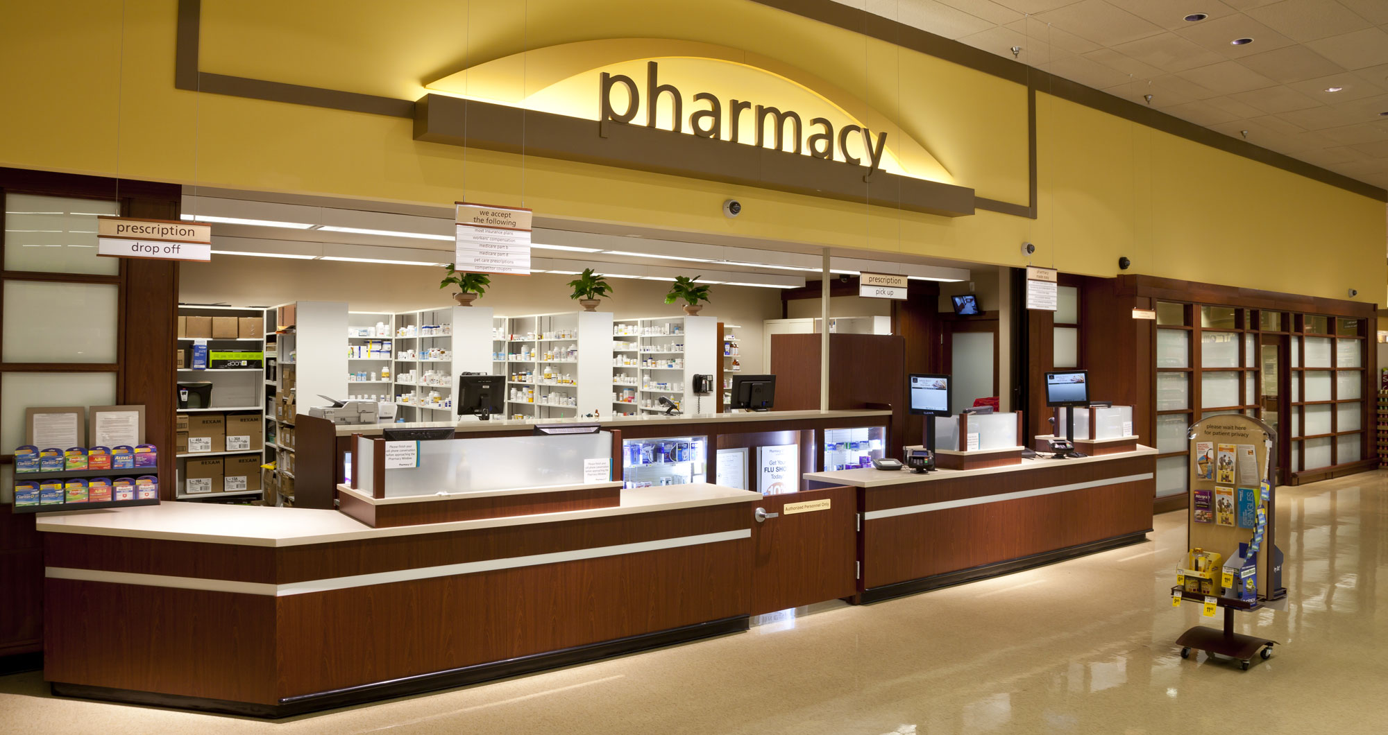
Party print & paper, greeting cards... and... greeting cards. Magzines... stationery... gift wrap. And then there's the pharmacy. This pharmacy is a lot smaller than what's in Lifestyle-era stores, lacking the fancy waiting rooms and clinics.

 
Aisle 12 checkpoint cleared! This time, treat yourself to breakfast and bake time essentials. On top we have the aisle marker itself, and below we have a look down into the aisle.
 
 What I appreciate about the marker's design is that it's viewable from four different angles: facing into the aisle and diagonally for perimeter shoppers entering in all directions, as well as facing away from the aisle for customer reference purposes. Additionally, the aisle header describes the categories of food that are expected, making it easy for customers to pair multiple items together for the described need. It's a shame Safeway didn't continue this into Lifestyle and beyond, personally. 
 
Down in the aisle, you can see the Marketplace-era gooseneck signs all intact. Those tend to go missing or be replaced with signage from modern decor packages at many retailers, so it's nice to see those remain from the last major remodel. At the end of the aisle, Safeway hosts the lunchmeat freezers, with a nice checkerboard signage enticing customers to shop for their picnic essentials.
All the m_ats you need for an unforgettable luncheon! I like how older supermarkets would also leave an alcove for departments like these, too.
 
 
Wanna know what goes well with meat & poultry? Beer, more specifically White Claws! 

 Here we are at the corner deli. Sure a lot going on here! Let's dissect it all.

 The first thing to see is the amount of product here. With a small space, it's nice that Safeway uses it well! The next portion is the varied walls and ceiling. It directs people to the counter, as well as partitioning off the department with everything else to the left.

Another forgotten art of grocery retail is the mezzanine. In my mind, it's a good idea to keep watch over the store and add another complex decor element challenge.

Finally, we arrive the at the checkouts, greeted by a sweet Express checkout ad. This sign, like the rest of the package gives off a West Coast vibe, at least in my mind. 

For our last interior shot, we stare down the front end's gallery of impulse buys.Ice packs, sunscreen, and seasonal buys are all available here (the latter being set to Halloween goods due to the time of year). Above, we meet up with the mezzanine again. This setup seems to be more peculiar than what's over the deli, like a catwalk enclosed on all four sides. I don't know if there are any offices above and out above the awning, but it likely could have been there as an observation deck before security cameras were commonplace.

For our last photos of the tour, we take a look at these rare Safeway signs, perhaps dating back to the store's opening (with some updates to match the Marketplace package). 

From what I've seen, it is becoming less common for supermarkets to advertise their in-store features outside. Whether signage costs have risen, delis/bakeries/etc. have become mainstream enough, or retailers would rather let the facade speak for itself, I can't tell for sure.

Conclusion

Thank you all for coming along with me today! In the years since this visit, the store was updated to the current Safeway package, as is the case with lots of local stores. However, said remodel appears to be less thorough than others, and the general vibe remains. Nevertheless, it's great that Marketplace lasted as long as it did here for me to capture it in all its glory. Now the biggest test remains if the store will remain intact in place - the latest plans to replace the center have stalled so far.

Anyhow, see you next time. Happy New Years' to all as well!

Thursday, December 25, 2025

Target - Dumfries, VA: New Coat, Old Heart

Welcome back to the Shoppes of Battery Mill, where seeing is believing! Today we head back to the wonderful Virginia city of Dumfries, where we will be embarking on a glorious Target run.

Photos taken July 18, 2023 (cover photo taken May 24, 2015)

Store information

  • Store number: T-2017
  • Address: 4174 Fortuna Center Plaza, Dumfries, Virginia 22025
  • Opening date: October 5, 2005
  • Decor package: P17
  • Features: CVS Pharmacy, Starbucks, Optical, PFresh, Beauty Blowout, E&E Innovation

Continuing from my tours of the now-closed Shoppers just a few doors down (part 1, part 2), this blog post explores the other anchor at the Fortuna Center Plaza. Located on the bustling Dumfries Road (VA 234) corridor, this Target, along with the rest of the center, serves southern Prince William County with a healthy dose of retail. 

The store opened in 2005 as an overflow for the Woodbridge store near the landmark Potomac Mills mall, helping all of this side of PWC go on their Target runs easier. The store has seen several upgrades, including PFresh and finally a remodel to the current Target prototype. Since Target has noted these remodels as being dynamic to each city's needs, it does beg the question. What has Target opted to modify here? We shall see as we make our rounds around the famous Target racetrack. But first... 

Store tour 

Let's fuel up at the Target Café. I think I'll get some teas from Starbucks and sit down to scroll on my phone for a bit... Oh wait, there's nowhere for me to sit at. On with the store tour, I guess. But not before we take a look at what has happened to the place also known as the Food Avenue.

Well, what could I tell you, half of the space is now devoted to e-commerce fulfillment. This is a change that has happened at nearly every Target which has not reconfigured its cafés in service of the new remodels (whether Starbucks-only, or featuring Taste of Target counters).

Stores like this one were constructed before smartphones and online shopping were both widespread, so it is highly likely there was nowhere else in the store to cram those metal racks of online orders on. This just happened to be a logical spot that was somewhat out of the way, and wasn't heavily trafficked.

There is more I'd like to note about this café, but that will have to wait for later in the post. Nevertheless, this portion of the store has eluded any actual paint work and redecoration - I like seeing that classic P04 magic still at work here! 

For comparison, this is how the area would look like before the furniture was removed. 

The first destination we will visit is the Toys & Games section. This department is mostly unchanged from before the remodel, sans endcap signage and other smaller facets (resets present at every Target store). 

Something one may notice is the ubiquitous red Target stripe is now a light gray, much like the walls from the rest of the store. I cannot tell a lie: the Cornell administration of Target certainly enjoys bending aspects of the stores' interior design that have remained intact for four score and seven years or more.

We now turn around to check some more toys out... electronic ones, that is. This happens to be another plain department, not featuring the black carpet, nor any special displays. This also happens to be one of the few departments where Target keeps the red walls intact during remodels. 

Nevertheless, we have ourselves a decent selection of physical video games in front of us, as well as other tech utilities like Chromebooks and printers. The far side, meanwhile is where the tech help desk is located. It, along with the ubiquitous TV wall, denote the perimeter of Target's tech section. I don't mind its sleek design, but I do miss the camera-focused setup from the store's original opening (approximation here).

From the back of the store, we turn the corner and align on the left-side race track. It is here where we witness the extent of the Dumfries Target's grocery options.

The store received the PFresh treatment around 2011, expanding grocery selections from standard dry grocery favorites to include fresh produce, meat, and more of said dry items. As with the remodel, the department now sports a black and woodgrain theme intended to resemble gourmet grocery markets.

This is now the only grocery option in the center, with Shoppers having shuttered. Food Lion and Lidl have stores nearby, however. 

We make our way back to the front of the store, where we notice the most widely changed department, that being one of Target's several "Beauty Blowout" Innovation concepts. Diagonal displays and a new wooden floor emphasize customers towards the latest trends in body care. Meanwhile, Target's new price scanner is visible one aisle over. I do wish those had maps on them, instead of directing them to the app. You'd think that Target would install the store maps on to the touch screen, but they don't. It would be handier for those without their phone on them, for instance.

On a side note, we're not done with grocery. In the right of the background, we can see the produce department. The lattice is an interesting touch, and matches the rest of the store's design philosophy, much like the previous round vinyl signs did.

Doing a 180 again, we find ourselves looking at Target's "Home" department. This is yet another sign Target took a barebones approach to remodeling this location. There doesn't seem to be a fancy Innovation department at play here, with the standard white gondolas roaming free atop a terrace of white linoleum.

Nevertheless, I appreciate that a piece of the classic Target remains here, adding a needed contrast to the more flashy departments we see above.

Finding ourselves in the middle of Health & Beauty now, we can see two service departments gesturing widely over the low HBC shelves and associated blue signage pieces. To the left of the background we have the ubiquitous CVS pharmacy, originally a Target Pharmacy upon the store's opening.

To the right is Target's eyeglass retailer/optometrist office. The Optical department is a recent addition to the store, coming with this Cornell-era remodel. I'm not asking for the specifics, but I do have to wonder if the Target Optical shop didn't diminish any Team Member services since it likely carved into backroom space.

Finally, we arrive at the registers. And I tell you, there's a lot going on here, even if no one is at these lanes to take our order.

While the register light was changed out following the remodel (to Target's current translucent design), the body of the register is a leftover from the store's original configuration. The Plexiglas dividers are also leftovers, that being from the pandemic era.

Behind one of those Plexiglas dividers we can see the ubiquitous trading card row that has been a staple at Target for years. I find it interesting that these are the normal aisle height, making these stand out far more. I opine this setup can be useful considering trading cards are all the rage these days.

On a final note, remember when I showed the Food Avenue seating area being devoid of, well, chairs and tables? Well, there's even worse news. The Pizza Hut Express and generic café have been walled off with a plain "Thanks for shopping at Target" sign.

Now, not every Target has lost these in the past decade, but it seems to be a veritable trend, and it's a shame this one no longer has these ready-made options. Target could have also done way better than leave a blank wall. At least the white strip and general shell remains.

Conclusion

Thank you all for reading through! I'm posting this on Christmas Day, so I wish you all a fun and festive holiday if you're reading on the very day.
 
I have one more post on the way this year, and from there, we'll turn our attention to 2026. More is going on this blog in the new year too!